Last updated on August 22, 2025
Violinplots are combination of boxplot and density plots. In this tutorial we will learn how to make Violinplots with Seaborn in Python and also show actual data points with violin plot.
👉 Want more? Explore the full Seaborn Tutorial Hub with 35+ examples, code recipes, and best practices.
We will use Penguin data set to learn to make violinplots with data points using Seaborn.
import matplotlib.pyplot as plt
import pandas as pd
import seaborn as sns
penguins_data="https://raw.githubusercontent.com/datavizpyr/data/master/palmer_penguin_species.tsv"
penguins_df = pd.read_csv(penguins_data, sep="\t")
penguins_df.head()
species	island	culmen_length_mm	culmen_depth_mm	flipper_length_mm	body_mass_g	sex
0	Adelie	Torgersen	39.1	18.7	181.0	3750.0	MALE
1	Adelie	Torgersen	39.5	17.4	186.0	3800.0	FEMALE
2	Adelie	Torgersen	40.3	18.0	195.0	3250.0	FEMALE
3	Adelie	Torgersen	NaN	NaN	NaN	NaN	NaN
4	Adelie	Torgersen	36.7	19.3	193.0	3450.0	FEMALE
At first we will see how to make a simple violin plot and then see four examples to show data on top of violin plot. Seaborn’s violinplot() function makes it easy to create a violin plot in Python. We just need to specify the x and y variables with the data.
plt.figure(figsize=(8,6))
sns.violinplot(y="culmen_length_mm",
                x="species",
                data=penguins_df)
plt.savefig("Seaborn_violinplot.png",
            format='png',dpi=150)
By default Seaborn’s violinplot() function show data distribution corresponding to multiple groups as violinplot with a small boxplot showing median values and quartiles.

Seaborn violinplot with data points using inner argument to violinplot()
Often, one might like to show the data points on top of violinplot. We can add data points to Seaborn’s violinplot using “inner” argument. The inner argument with “points” will show the data as points on the violinplot.
sns.set_context("talk", font_scale=1.1)
plt.figure(figsize=(8,6))
sns.violinplot(y="culmen_length_mm",
                x="species",
                data=penguins_df,
               inner="points")
plt.savefig("Seaborn_violinplot_with_data_points.png",
            format='png',dpi=150)

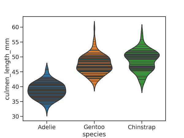
We can also use inner argument with “stick” option. This option show data as lines on violin plot.
sns.set_context("talk", font_scale=1.1)
plt.figure(figsize=(8,6))
sns.violinplot(y="culmen_length_mm",
                x="species",
                data=penguins_df,
               inner="stick", alpha=0.3)
plt.savefig("Seaborn_violinplot_with_data_points_inner_stick.png",
            format='png',dpi=150)

Seaborn violinplot with data points using swarmplot()
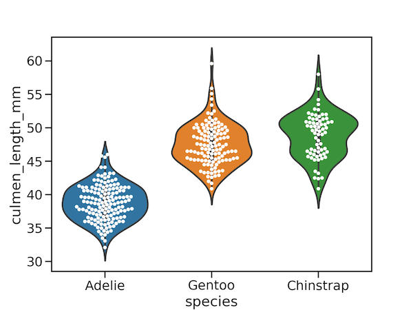
Although Seaborn violinplot’s inner option do show data in two ways, They are a bit cumbersome. For example, inner=”points” option show data points in a single line making the overlapping data points difficult to see. A better option is to have jittered data points. One way to show jittered data points on top of violinplot is to use Seaborn’s swarmplot() after violinplot.
sns.set_context("talk", font_scale=1.1)
plt.figure(figsize=(8,6))
sns.violinplot(y="culmen_length_mm",
                x="species",
                data=penguins_df)
sns.swarmplot(y="culmen_length_mm",
                x="species",
                data=penguins_df,
                   color="white", edgecolor="gray")
plt.savefig("Seaborn_violinplot_with_points_swarmplot.png",
            format='png',dpi=150)br
We get a swarmplot showing the data on top of violinplot and with similar shape as violinplot. Here we have customized the data points in swarmplots to white with grey outline.

Seaborn violinplot with data points using stripplot()
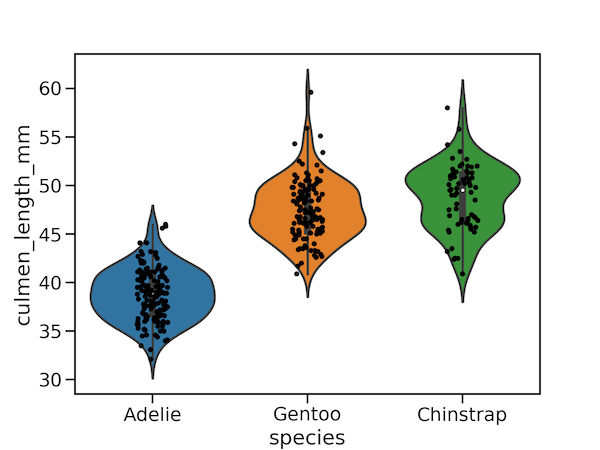
We can also use Seaborn’s stripplot() function to add jittered data points as another layer on violinplot. We would first make violin plot and then use stripplot() to add jittered data points.
sns.set_context("talk", font_scale=1.1)
plt.figure(figsize=(8,6))
sns.violinplot(y="culmen_length_mm",
                x="species",
                data=penguins_df)
sns.stripplot(y="culmen_length_mm",
                x="species",
                data=penguins_df,
              color="black", edgecolor="gray")
plt.savefig("Seaborn_violinplot_with_points_stripplot.png",
            format='png',dpi=150)
We get a nice violin plot with actual data points on top of it. Here we have customized the jittered data color to black.


