Last updated on August 24, 2025
Want to show relationships between paired observations or track changes across groups in your boxplots? This comprehensive guide shows you exactly how to connect points boxplot ggplot2 using lines, with practical examples for before/after studies, paired data, and longitudinal analysis.
Standard boxplots are excellent for comparing distributions, but they don’t reveal relationships between individual data points across groups. By connecting related observations with lines, you can visualize paired data, treatment effects, or changes over time while maintaining the distribution summary that boxplots provide.
In this tutorial, you’ll master creating boxplot with lines ggplot2 visualizations using geom_line(), geom_path(), and advanced grouping techniques. Whether you’re analyzing clinical trial data, A/B testing results, or longitudinal studies, these methods will help you create informative visualizations that tell the complete data story.
Loading Packages and Data for connecting boxplots with lines
Let us load tidyverse and gapminder package. We will work with gapminder dataset to make the boxplot connected by lines.
library(tidyverse)
library(gapminder)
theme_set(theme_bw(16))
Preparing Paired Data from the gapminder Dataset
We will use the gapminder dataset to see how life expectancy has changed for countries in the Americas between 1952 and 2007. In this context, the “paired” data points are the two life expectancy measurements for the same country at two different times.
Let’s filter the data for just the years 1952 and 2007 and the “Americas” continent. Most importantly, we’ll create a new column called paired. This column will act as a unique identifier for each pair (i.e., for each country) that tells ggplot2 which points to connect.
library(gapminder)
df = gapminder |>
  filter(year %in% c(1952,2007)) |>
  filter(continent %in% c("Americas")) |>
  select(country,year,lifeExp) |>
  mutate(paired = rep(1:(n()/2),each=2),
         year=factor(year))
Now we have our datadrame ready for making boxplot with points connected by lines. Let’s inspect the resulting data frame. Notice how Argentina has a paired value of “1” for both years, Bolivia has a value of “2”, and so on. This grouping is the key to connecting the lines correctly.
df |> head()
## # A tibble: 6 x 4
##   country   year  lifeExp paired
##   <fct>     <fct>   <dbl>  <int>
## 1 Argentina 1952     62.5      1
## 2 Argentina 2007     75.3      1
## 3 Bolivia   1952     40.4      2
## 4 Bolivia   2007     65.6      2
## 5 Brazil    1952     50.9      3
## 6 Brazil    2007     72.4      3
Simple Boxplots with ggplot2
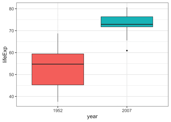
Before connecting points, let’s create a simple boxplot to see the overall distribution of life expectancy in 1952 versus 2007. We use geom_boxplot() to make boxplot with ggplot2.
df |>
  ggplot(aes(year,lifeExp, fill=year)) +
  geom_boxplot() +
  theme(legend.position = "none")
First attempt at Connecting Paired Points on Boxplots with ggplot2
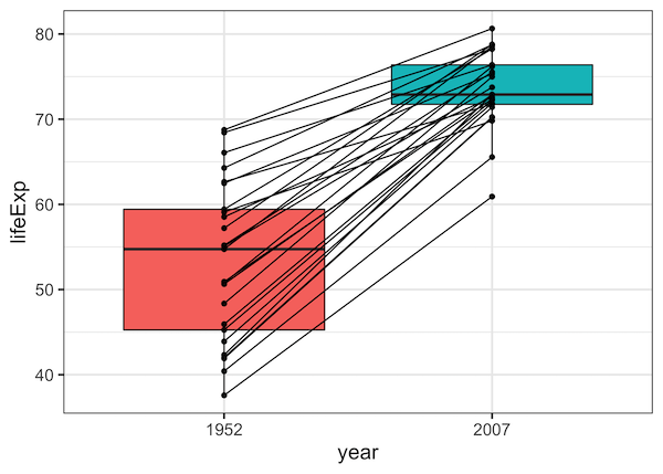
Let us first add data points to the boxplot using geom_point() function in ggplot2. To connect the data points with line between two time points, we use geom_line() function with the variable “paired” to specify which data points to connect with group argument.
df |>
  ggplot(aes(year,lifeExp, fill=year)) +
  geom_boxplot() +
  geom_point()+
  geom_line(aes(group=paired)) +
  theme(legend.position = "none")
Our first effort to make boxplot with data points connected by lines is successful. However, all the points are plotted in a straight vertical line, making it impossible to distinguish individual countries.
Connecting Paired Points with jitter on Boxplots with ggplot2
Although our first try at connecting paired points with lines is successful, multiple overlapping data points causes over-plotting issue. A better solution is to have jittered data points on boxplot and have lines connecting the jittered data point.
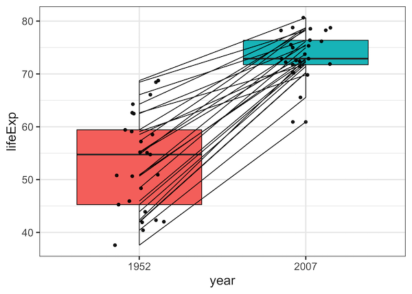
Let us try changing geom_point() function to geom_jitter().
df |>
  ggplot(aes(year,lifeExp, fill=year)) +
  geom_boxplot() +
  geom_line(aes(group=paired)) +
  geom_jitter(aes(fill=year,group=paired), width=0.15) +
  theme(legend.position = "none")
This doesn’t work! The points are jittered, but the lines are not. The lines still start and end at the center, completely disconnected from the points they are supposed to represent. This happens because geom_line and geom_jitter don’t know about each other’s positions.
How to Connect Paired Points with lines on Boxplots with ggplot2?
The challenge was not using the jittered position while drawing lines. To fix this, we need to ensure that both the points and the lines are shifted by the exact same amount. The solution is to use position_dodge() instead of geom_jitter(). By applying the same position_dodge() to both geom_line() and geom_point(), we guarantee they will be perfectly aligned.
A solution to connect paired data points with jitter is to specify the position for the data points and lines.
Here we use position arguments in both geom_line() and geom_point() functions. We specify the same argument “position = position_dodge(0.2)” to add lines between boxplot with jittered points.
df |>
  ggplot(aes(year,lifeExp, fill=year)) +
  geom_boxplot() +
  geom_line(aes(group=paired), position = position_dodge(0.2)) +
  geom_point(aes(fill=year,group=paired), position = position_dodge(0.2)) +
  theme(legend.position = "none")
Our boxplot with connected lines looks great. The points are dodged to avoid overplotting, and the lines correctly connect the paired points.

Customizing Boxplots with Lines Connecting Paired Points
As we saw in the examples above, when you have paired observations, (such as repeated measurements on the same subject across time points), it is better connect those pairs with lines. This helps show the within-subject changes that boxplots alone can obscure. Below we show several ways to customize
boxplots with connecting lines using ggplot2.
Example 1: Match Data Point Colors to Boxplots
By default, data points connected by lines are black.
We can improve interpretability by making the points match the box colors.
Using hollow circles (shape = 21) lets us control both fill and outline colors.
df |>
  ggplot(aes(year,lifeExp, fill=year)) +
  geom_boxplot() +
  geom_line(aes(group=paired), position = position_dodge(0.2)) +
  geom_point(aes(fill=year,group=paired),size=2,shape=21, position = position_dodge(0.2)) +
  theme(legend.position = "none")
Here, geom_point() uses shape = 21 and a fill aesthetic so that the point color matches the boxplot’s fill, improving the visual link between groups.

Example 2: Add a Summary Line to Highlight the Trend
In addition to connecting individual observations, we can summarize the overall trend by overlaying a mean line. A dashed red line across years highlights the overall trend between the groups in the boxplot.
df |>
  ggplot(aes(year, lifeExp, fill = year)) +
  geom_boxplot(width = 0.5, alpha = 0.5, outlier.shape = NA) +
  # Individual country lines (more transparent)
  geom_line(aes(group = paired), color = "grey70", alpha = 0.7, position = position_dodge(0.2)) +
  geom_point(aes(group = paired), shape = 21, size = 2, position = position_dodge(0.2)) +
  # Add the summary line for the mean
  stat_summary(
    aes(group = 1), # Group all points together for the summary
    fun = "mean",
    geom = "line",
    color = "red",
    linewidth = 1.2,
    linetype = "dashed"
  ) +
  labs(
    title = "Overall Trend in Life Expectancy",
    subtitle = "Red dashed line shows the average change",
    x = "Year",
    y = "Life Expectancy"
  ) +
  theme(legend.position = "none")
ggsave("add_summary_line_boxplot_with_connected_points.png")

Example 3: Add statistical significance
Often, for example in working with clinical data, you want to formally test whether the paired difference is significant. With ggpubr you can overlay stat_compare_means() to display a p-value directly on the plot.
library(ggpubr)

df |>
  ggplot(aes(year, lifeExp, fill = year)) +
  geom_boxplot(width = 0.5, alpha = 0.7) +
  geom_line(aes(group = paired), color = "grey40", position = position_dodge(0.2)) +
  geom_point(aes(group = paired), size = 2.5, shape = 21, position = position_dodge(0.2)) +
  # Add the statistical comparison
  stat_compare_means(
    method = "t.test",
    paired = TRUE,
    label.y = 85, # Position the p-value on the y-axis
    label = "p.format"
  ) +
  labs(
    title = "Life Expectancy Increased Significantly",
    subtitle = "Result from a paired t-test shown above",
    x = "Year",
    y = "Life Expectancy"
  ) +
  theme(legend.position = "none")
ggsave("add_p-value_to_boxplot_with_connected_points.png")

Example 4: Highlight Specific Outlier Trajectories
Finally, you may want to draw attention to a particular subject or group.
Here we highlight Haiti in a different color and line thickness, while other
trajectories remain grey.
# Create a new column to identify the country to highlight
df_highlight <- df |>
  mutate(highlight = ifelse(country == "Haiti", "Haiti", "Other"))

df_highlight |>
  ggplot( aes(year, lifeExp, fill = year)) +
  geom_boxplot(width = 0.5, alpha = 0.4, outlier.shape = NA) +
  # Draw all lines in grey first
  geom_line(
    data = . %>% filter(highlight == "Other"), # Use a subset of data for grey lines
    aes(group = paired),
    color = "grey70",
    position = position_dodge(0.2)
  ) +
  # Draw the highlighted line in a different color and size
  geom_line(
    data = . %>% filter(highlight == "Haiti"), # Use a subset for the highlighted line
    aes(group = paired),
    color = "#D55E00",
    linewidth = 1.2,
    position = position_dodge(0.2)
  ) +
  geom_point(aes(group = paired), shape = 21, size = 2, position = position_dodge(0.2)) +
  labs(
    title = "Highlighting a Specific Country's Trajectory",
    subtitle = "The story of Haiti stands out from the rest",
    x = "Year",
    y = "Life Expectancy"
  ) +
  theme(legend.position = "none")
ggsave("highlight_specific_paired_data_boxplot_with_connected_points.png")

Explore the Complete ggplot2 Guide
35+ tutorials with code: scatterplots, boxplots, themes, annotations, facets, and more—tested and beginner-friendly.
Visit the ggplot2 Hub → No fluff—just code and visuals.


