Last updated on July 1, 2022
Boxplots with overlayed data points is a great way visualize multiple distributions. One of the biggest benefits of adding data points over the boxplot is that we can actually see the underlying data instead of just the summary stat level data visualization. Sometimes using text labels instead of data points can be helpful as it can quickly identify the samples that are outliers.
In this post, we will learn how to make boxplots with text describing the data points instead of data points.
library(tidyverse)
Let us create some data from scratch. Here we generate three groups of different sizes and numerical values for each of them.
# create dataframe with simulated data
df <- data.frame(group=c(rep("A",9),
                         rep("B",10),
                         rep("C",15)),
                 value=c(rnorm(9),
                         rnorm(10),
                         rnorm(15)),
                 stringsAsFactors = FALSE )
Let us also add sample ID number for each group’s data points. Later, we will use this sample identity to plot instead of data points.
df <- df %>%
  group_by(group) %>%
  mutate(id = row_number()) %>%
  unite("ID", c(group,id), sep="",remove=FALSE)
We can look at the data and see that it has sample ID variable in addition to group and value variables.
head(df)

## # A tibble: 6 x 4
## # Groups:   group [1]
##   ID    group   value    id
##   <chr> <chr>   <dbl> <int>
## 1 A1    A     -0.136      1
## 2 A2    A      0.832      2
## 3 A3    A      0.442      3
## 4 A4    A      0.0640     4
## 5 A5    A     -0.402      5
## 6 A6    A     -0.762      6
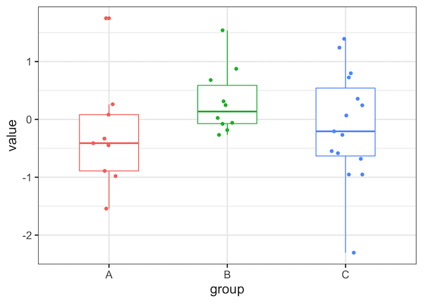
Let us first make a simple boxplots with data points overlayed on boxplot. To do that we will first make boxplot with geom_boxplot() and then add jittered data points using geom_jitter(). We have also removed the legend for the boxplot as it is redundant.
df %>%
  ggplot(aes(x=group, y=value, color=group))+
  geom_boxplot(width=.5)+
  geom_jitter(width=0.15)+
  theme(legend.position="none")
Boxplots with Text as Points in R using ggplot2 using geom_text()
One of the simplest ways to make boxplot with text label instead of data points is to use geom_text(). We use geom_text() instead of geom_point() or geom_jitter() and here we add jitter to text using “position_jitter”.
df %>%
  ggplot(aes(x=group,y=value, label = ID, color=group))+
  geom_boxplot(width=.5)+
  # jittered text with geom_text
  geom_text(check_overlap = TRUE,
            position=position_jitter(width=0.15))+
  theme(legend.position="none")
We get a nice boxplot with text lables as points. Clearly boxplot with small labels are great, but with this simple approach bigger text labels can be problematic.
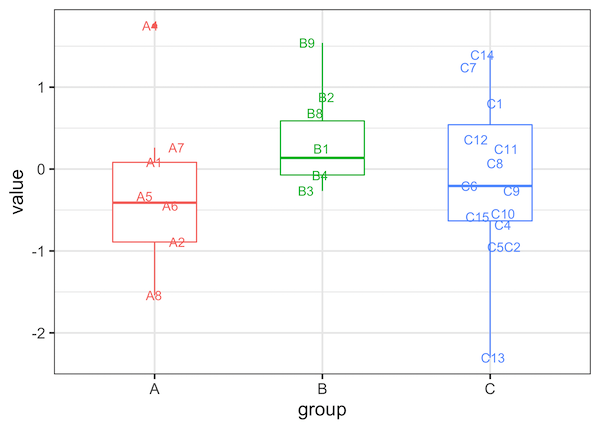
It is often useful in scenarios where we only need to highlight a few samples of interest with text as data points instead of all the points.
Explore the Complete ggplot2 Guide
35+ tutorials with code: scatterplots, boxplots, themes, annotations, facets, and more—tested and beginner-friendly.
Visit the ggplot2 Hub → No fluff—just code and visuals.