Last updated on April 1, 2020
Time Series Plots are line plots with x-axis being date time instead of regular quantitative or ordered categorical variable. Sometimes you might want to highlight a region on a time series plot. In this post, we will learn how to highlight a time interval with a rectangular colored block in Python using Matplotlib.
Let us load Pandas, Numpy and Matplotlib to make time series plot.
import pandas as pd
import numpy as np
import matplotlib.pyplot as plt
In order to make time series plot we will use latest (March 2020) unemployment claims data in US, where we saw a huge spike in unemployment claims due to COVID-19.
Let us load the US unemployment claim data available from datavizpyr.com‘s github page.
data_url = "https://raw.githubusercontent.com/datavizpyr/data/master/US_Unemployment_claims.tsv"
df = pd.read_csv(data_url, sep="\t")
This dataframe has two variable/columns, date and the number of unemployment claims starting from 1970s to March 2020.
df.head()

date	value
0	1970-01-03	230000.0
1	1970-01-10	242000.0
2	1970-01-17	268000.0
3	1970-01-24	256000.0
4	1970-01-31	239000.0
The date variable in the above data frame is of object data type, so let us convert it to a datetime variable using Pandas’ to_datetime().
df['date']= pd.to_datetime(df['date'])
We can check the data types using Pandas’ dtypes method and verify our data types.
df.dtypes
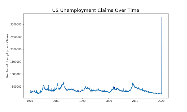
Let us first make a simple time-series plot with Matplotlib’s plot function. We will take the subplots option to make time-series plot and this gives us two objects, a figure object and an axis object. We use axis object to make time series plot. We can use axis object to change x and y-axis labels and title.
fig, ax = plt.subplots(figsize=(10,6))
ax.plot(df['date'],df['value'])
ax.set_ylabel('Number of Unemployment Claims')
ax.set_title('US Unemployment Claims Over Time', size=18)
plt.savefig("US_unemployment_claims_time_series_plot_matplotlib.png")
We get a nice looking time series plot with the omnious increase in unemployment claims near the beginning of 2020.
How To Highlight a Region of Time-Series Plot with Matplotlib?
We can use matplotlib’s axvspan() function to highlight an interval on a time series plot. One of the challenges in highlighting a specific time interval or range in time series plot is to specify the interval as date.
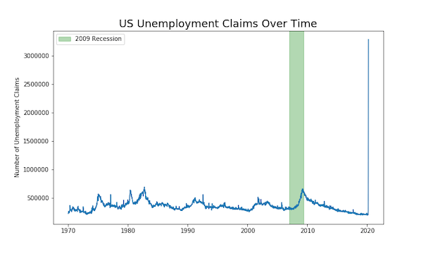
Let us say in the above time series plot, we want to highlight the time interval corresponding to the 2007-2009 recession. We need to map the starting and end dates on the plot. We will use datetime and matplotlib.dates to do that.
from datetime import datetime
from matplotlib.dates import date2num
In addition to making the time-series plot as before, we will also use axvspan() function to highlight the time interval. Within axvspan() function, we use date2num() function from matplotlib.dates to convert the date to numbers.
fig, ax = plt.subplots(figsize=(10,6))
ax.plot(df['date'],df['value'])
ax.axvspan(date2num(datetime(2007,1,12)), date2num(datetime(2009,6,1)),
           label="2009 Recession",color="green", alpha=0.3)
ax.legend()
ax.set_ylabel('Number of Unemployment Claims')
ax.set_title('US Unemployment Claims Over Time', size=18)
plt.savefig("highlight_time_range_in_time_series_plot_matplotlib.png")
We have nicely highlighted the recession time interval on time series plot. The color argument to axvspan() function has highlighted the interval in green nicely. And the label argument has added the legend on the time-series plot.