Grouped boxplots help us visualize the relationship between three variables, two categorical variables and one quantitative variable. When we make a boxplot, it is always a good idea to add the original data points on top of the boxplot, when possible. In this post, we will learn how to make grouped boxplots with jittered data points on the boxplots using Seaborn in Python.
Let us load the libraries needed for making grouped boxplots.
import matplotlib.pyplot as plt
import pandas as pd
import seaborn as sns
We will use Palmer penguin’s dataset from Seaborn’s built-in datasets.
penguins = sns.load_dataset("penguins")
penguins.head()


species	island	bill_length_mm	bill_depth_mm	flipper_length_mm	body_mass_g	sex
0	Adelie	Torgersen	39.1	18.7	181.0	3750.0	Male
1	Adelie	Torgersen	39.5	17.4	186.0	3800.0	Female
2	Adelie	Torgersen	40.3	18.0	195.0	3250.0	Female
3	Adelie	Torgersen	NaN	NaN	NaN	NaN	NaN
4	Adelie	Torgersen	36.7	19.3	193.0	3450.0	Female
How to Make Grouped Boxplot with Seaborn’s catplot()?
Let us use Seaborn’s function catplot() to make a boxplot. With catplot() function, we specify kind=”box” to make boxplot. And to make grouped boxplot using catplot(), we will specify “hue” argument and specify the third variable we would to group.
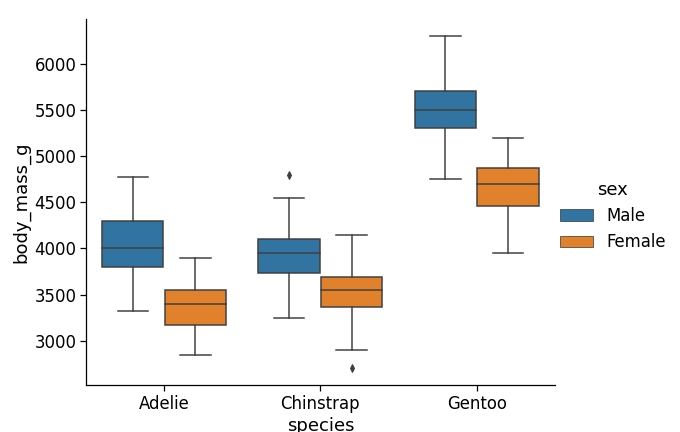
In this example below, we make grouped boxplot with Seaborn’s catplot() function to see the relationship between species, body mass and sex in Palmer penguin data.
sns.set_context("notebook", font_scale=1.5)
plt.figure(figsize=(10,8))
sns.catplot(x='species',
            y='body_mass_g',
            hue="sex",
            kind="box",
            data=penguins,
            height=6,
            aspect=1.3);
plt.savefig("grouped_boxplot_Seaborn_Catplot_Python.png")
And we get a nice grouped boxplot with boxes filled by the third grouping variable.
How to Make Grouped Boxplot with Data Points using Seaborn’s catplot()?
Let us forst try to add data points to grouped data points. We will first make grouped boxplot and then add the original data points using Seaborn’s stripplot() function.
sns.set_context("notebook", font_scale=1.5)
plt.figure(figsize=(10,10))
grped_bplot = sns.catplot(x='species', y='body_mass_g',
                 hue="sex",
                data=penguins, kind="box",
            #palette="Set2",
            legend=False,
            height=6, aspect=1.3);

# make grouped stripplot
grped_bplot = sns.stripplot(x='species', y='body_mass_g',
              data=penguins,
              hue='sex',
              marker='o',
              alpha=0.5)
plt.savefig("grouped_boxplot_with_jittered_data_points_Seaborn_Python_first_try.png")
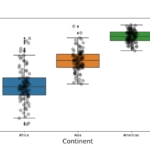
Our first try at making grouped boxplot with data points look like this.

We can see that our grouped boxplot with original data points does not look quite right.One of the problems is that our data points do not align with grouped boxplots. And another issue we see is that now we have two redundant set of legends one from our boxplot and the second from stripplot() function.
Grouped Boxplots with data in Python: Getting it Right
Let us see how can we improve our grouped boxplots with original data points.
To make sure the original data points align with grouped boxplots, we specify “dodge=True” as argument to Seaborn’s stripplot() function.
And to remove one of the redundant legends, we use Matplotlib’s get_legend_handles_labels() function and use just one of the legends using legends() function.
grped_bplot = sns.catplot(x='species',
                          y='body_mass_g',
                          hue="sex",
                          kind="box",
                          legend=False,
                          height=6,
                          aspect=1.3,
                          data=penguins);
# make grouped stripplot
grped_bplot = sns.stripplot(x='species',
                            y='body_mass_g',
                            hue='sex',
                            jitter=True,
                            dodge=True,
                            marker='o',
                            palette="Set2",
                            alpha=0.5,
                            data=penguins)
# how to remove redundant legends in Python
# Let us first get legend information from the plot object
handles, labels = grped_bplot.get_legend_handles_labels()
# specify just one legend
l = plt.legend(handles[0:2], labels[0:2])
plt.savefig("grouped_boxplot_with_jittered_data_points_Seaborn_Python.png")
Voila! we now get a grouped boxplots with original data points jittered correctly on the boxplots. In this example, we have also specified color for data points.