Boxplot with data points on top of it is often better visualization technique than the boxplots alone. This is mainly because, boxplot with data points actually shows the data underlying the boxplots, while the boxplot alone just shows the summary statistics. Always remember, Anscombe’s quartet, while using only summary statitics.
In this tutorial, we will see learn how to make boxplots with Python using Seaborn and the see examples of adding data points to boxplots using Seaborn in Python.
Loading packages and simulating data
Let us load the packages needed, Seaborn, matplotlib, and pandas.
import seaborn as sns
import matplotlib.pyplot as plt
import pandas as pd
import numpy as np
Let us generate data to plot using Numpy’s random module and store the variables in Pandas data frame.
# seed for random numbers
np.random.seed(31)
# Generating Data
df = pd.DataFrame({
    'Africa': np.random.normal(40, 15, 100),
    'Asia': np.random.normal(60, 10,100),
    'Americas': np.random.normal(80, 5, 100)
})
print(df.head())
The data we generated is in wide-form. Let us transform the data from wide to long form using Pandas’ melt function.
data_df = df.melt(var_name='continent',value_name='lifeExp')
print(data_df.head())
Now we have the data needed to make some boxplots.
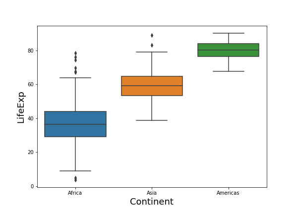
Simple Boxplot with Python
Let us first make a simple boxoplot with Seaborn. We provide the data frame and the variables needed to mnake boxplot.
# boxplot with seaborn
sns.boxplot(x = "continent",
            y = "lifeExp",
            data = data_df)
Seaborn’s simple boxplot fills the boxes with colors automatically.
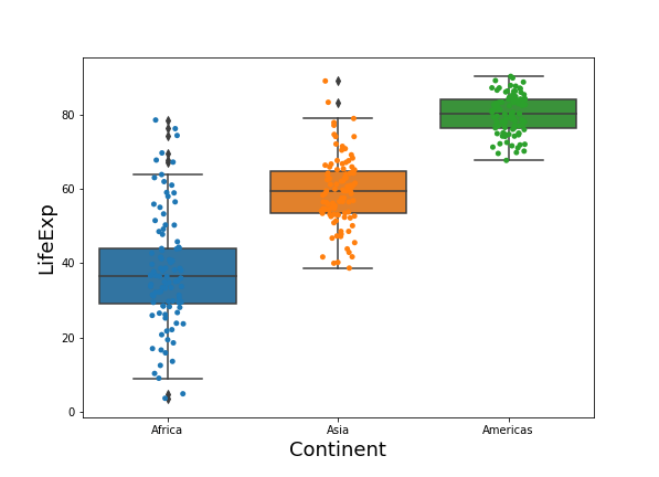
Seaborn Boxplots with data points (same color points as box)
To add data points on top of the boxplot, we can use Seaborn’s stripplot immediately after plotting boxplot with Seaborn. Seaborn’s stripplot adds random noise by default, i.e. the default jitter argument is True. By setting jitter=False, you will get points overlapping on each other.
# boxplot with jittered data points in python
sns.boxplot(x = "continent",
            y = "lifeExp",
            data = data_df)
sns.stripplot(x = "continent",
              y = "lifeExp",
              data = data_df)
Now we get boxplot with points as we wanted. By default, Seaborn chooses the same colors for filling the boxes and coloring the data points.
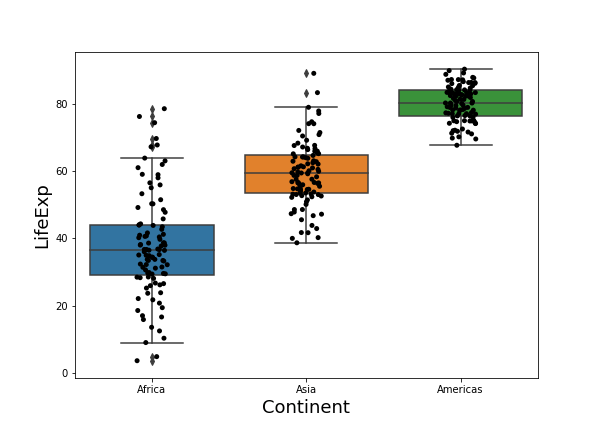
Seaborn Boxplot with data points, but data points in different color
If you want to have the data points colored differently, we can specify the color to the Seaborn’s stripplot function. In this example, we make the jittered points to be black with color=’black’ option.
sns.boxplot(x = "continent",
            y = "lifeExp",
            data = data_df)
sns.stripplot(x = "continent",
              y = "lifeExp",
              color = 'black',
              data = data_df)
Now our boxplot is filled with Seaborn colors and the data points are in black color.
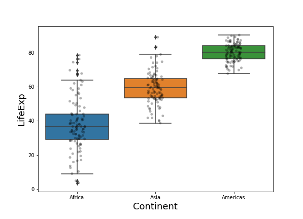
Seaborn Boxplot with transparent data points
When you have a lot of data points, overplotting may become a problem as many data points will overlap on each other. A solution is to increase the transparency of black data points we plotted with Seaborn’s stripplot.
sns.boxplot(x = "continent",
            y = "lifeExp",
            data = data_df)
sns.stripplot(x = "continent",
              y = "lifeExp",
              color = 'black',
              alpha = 0.3,
              data = data_df)
We can change the transparency to data points by setting alpha values to be in the range 0 to 1, 0 being completely transparent/invisible to 1 being completely opaque.
In our plot we have set the transparency level to 0.3.
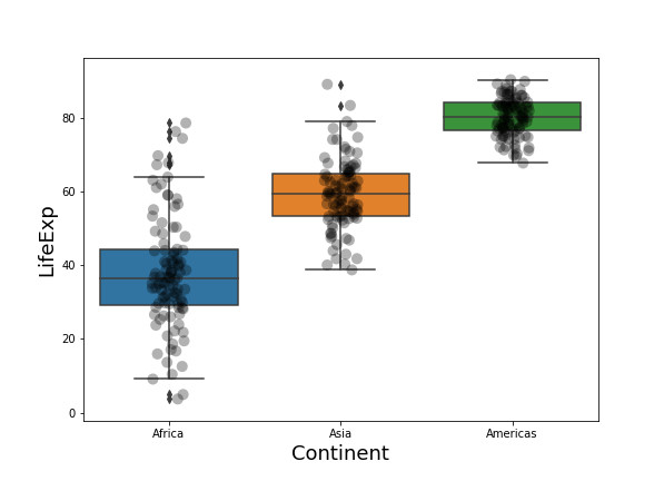
Seaborn Boxplots with data points of larger size
Similarly, if you find the data points plotted by strippplot is too small, you can increase the size of the points using size argument inside Seaborn’s stripplot as shown below.
sns.boxplot(x = "continent",
            y = "lifeExp",
            data = data_df)
sns.stripplot(x = "continent",
              y = "lifeExp",
              color = 'black',
              size = 10,
              alpha = 0.3,
              data = data_df)
plt.xlabel("Continent", size=18)
plt.ylabel("LifeExp", size=18)