
If you've ever stared at a column of numbers in a dataset and struggled to understand its underlying story, you're not alone. Raw data tells us little about the bigger picture. This is where the histogram shines. It's more than just a bar chart; it's your fastest tool for … [Read more...] about Histograms with Seaborn in Python
Seaborn
How to Combine Two Seaborn plots with Shared y-axis
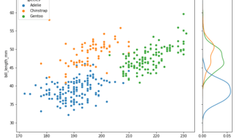
In this tutorial, we will see how to join or combine two plots with shared y-axis. As an example, we will make a scatterplot and join with with marginal density plot of the y-axis variable matching the variable colors. Thanks to Seaborn's creator Michael Waskom's wonderful tip on … [Read more...] about How to Combine Two Seaborn plots with Shared y-axis
How to Change Colors in Seaborn (Custom Palettes and Manual Colors)
Seaborn picks sensible default colors when you map a variable to hue, but real projects often need more control—consistent brand colors across plots, color-blind–friendly choices, or publication-ready figures. This hands-on tutorial shows exactly how to change colors in Seaborn, … [Read more...] about How to Change Colors in Seaborn (Custom Palettes and Manual Colors)
How to Customize Titles in Multi-Panel plots with Seaborn?
Multi-panel plots or small multiples are a great way visualize the relationship between two variables with respect ot the values of other variables. Seaborn offers a few different ways to make a multi-panel plots, with FacetGrid is the class behind multi-panel plots in … [Read more...] about How to Customize Titles in Multi-Panel plots with Seaborn?
Grouped Boxplot with Jittered Points with Seaborn Python

Grouped boxplots help us visualize the relationship between three variables, two categorical variables and one quantitative variable. When we make a boxplot, it is always a good idea to add the original data points on top of the boxplot, when possible. In this post, we will learn … [Read more...] about Grouped Boxplot with Jittered Points with Seaborn Python