
Grouped boxplots help us visualize the relationship between three variables, two categorical variables and one quantitative variable. When we make a boxplot, it is always a good idea to add the original data points on top of the boxplot, when possible. In this post, we will learn … [Read more...] about Grouped Boxplot with Jittered Points with Seaborn Python
Python
How To Change Edge Color on Seaborn Scatter Plot?
Seaborn's scatterplot function allows us to make compelling scatter plots easily. In this post we will learn how to customize edge color of a scatter plot made with Seaborn. By default, Seaborn's scatter plot function colors the markers edge color to be white. In this post, … [Read more...] about How To Change Edge Color on Seaborn Scatter Plot?
How To Make Lower Triangular Heatmap with Python?
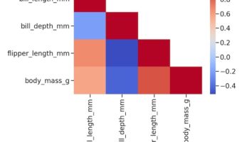
Heatmaps are a great way to quickly visualize the actual data coded as colors. Heatmaps of correlation matrix is useful to understand the relationship between multiple features or variable. However, since the correlation matrix is symmetric, it is more useful to make heatmap of … [Read more...] about How To Make Lower Triangular Heatmap with Python?
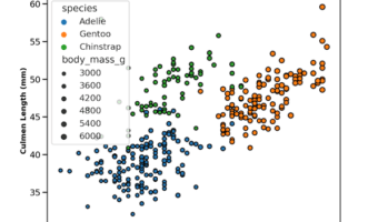
How To Color Scatterplot by a variable in Matplotlib?

Scatterplots between two numerical variables are great to see the relationship between them. Adding colors to the data points based on the third categorical variable is often useful in understanding the relationship among the three variables. In this post, we will learn how to … [Read more...] about How To Color Scatterplot by a variable in Matplotlib?
How to Make Scatterplot with Marginal Density Plots with Seaborn
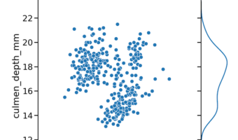
In this tutorial, we will use Seaborn and learn how to make a scatterplot between two quantitative variables with marginal density plots on the sides. We will use Seaborn's JointGrid() to define the features of the plot and then add scatter plot on top first and then add … [Read more...] about How to Make Scatterplot with Marginal Density Plots with Seaborn