
In this tutorial, we will see examples of how to make grouped barplots using Seaborn in Python. Barcharts are great when you have two variables one is numerical and the other is a categorical variable. A barplot can reveal the relationship between them. A Grouped barplot is … [Read more...] about How To Make Grouped Barplots in Python with Seaborn?
Python
Grouped Boxplots in Python with Seaborn
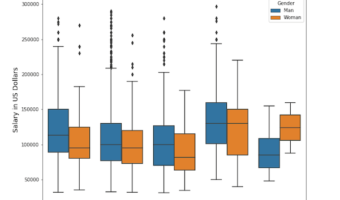
In this post, we will learn how to make grouped boxplots in Python using Seaborn's boxplot function. Grouped boxplots are a great way to visualize when you have three variables, where one of them is a numerical variable and the other two are categorical variables. Let us load … [Read more...] about Grouped Boxplots in Python with Seaborn
How To Make Bubble plot with Altair in Python?
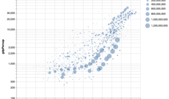
Bubble plot is a data visualization technique that shows bubbles i.e. circles on a two dimensional plot. Bubble plot is simply a scatter plot where we plot bubbles/circles instead of points in a scatter plot. Bubble chart is useful when you have three variables and the size of … [Read more...] about How To Make Bubble plot with Altair in Python?
How To Color a Scatter Plot by a Variable in Altair?
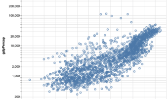
In this tutorial, we will learn how to color data points in a scatter plot by a variable using Altair in Python. Let us load Altair and Pandas. We will use gapminder data to make scatter plot first and color by a variable using Altair. To make a simple scatter … [Read more...] about How To Color a Scatter Plot by a Variable in Altair?
How to Create a Heatmap in Python with Seaborn (Step-by-Step Guide)
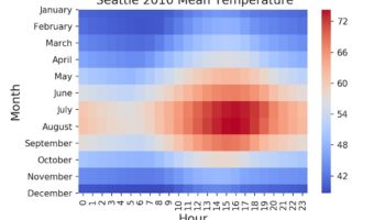
Heatmaps are perfect for showing patterns across two categorical axes (e.g., months × years) with a numeric value mapped to color. Heatmaps make it easy to spot seasonality, gradients, clusters, and outliers in two-dimensional data. In Python, Seaborn’s heatmap() makes it easy to … [Read more...] about How to Create a Heatmap in Python with Seaborn (Step-by-Step Guide)