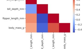
Heatmaps are a great way to quickly visualize the actual data coded as colors. Heatmaps of correlation matrix is useful to understand the relationship between multiple features or variable. However, since the correlation matrix is symmetric, it is more useful to make heatmap of … [Read more...] about How To Make Lower Triangular Heatmap with Python?
heatmap
Hierarchically-clustered Heatmap in Python with Seaborn Clustermap

In this post, we will learn how to make hierarchically clustered heatmap in Python. We will use Saeborn's Clustermap function to make a heat map with hierarchical clusters. Seaborn's Clustermap is very versatile function, but we will showcase the use of the function with just one … [Read more...] about Hierarchically-clustered Heatmap in Python with Seaborn Clustermap
How to Create a Heatmap in Python with Seaborn (Step-by-Step Guide)
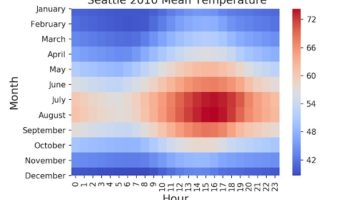
Heatmaps are perfect for showing patterns across two categorical axes (e.g., months × years) with a numeric value mapped to color. Heatmaps make it easy to spot seasonality, gradients, clusters, and outliers in two-dimensional data. In Python, Seaborn’s heatmap() makes it easy to … [Read more...] about How to Create a Heatmap in Python with Seaborn (Step-by-Step Guide)
Heatmap from Matrix using ggplot2 in R

Heatmaps are data visualization tool that displays a matrix of data as a matrix of colors. For example, matrix elements with low values will have lighter colors and the elelments with high values will have a darker color. In earlier post we saw examples of making heatmap … [Read more...] about Heatmap from Matrix using ggplot2 in R