Last updated on August 29, 2025
Want to display both median and mean values in your boxplot visualizations? This comprehensive guide shows you exactly how to seaborn boxplot show mean using multiple methods, with ready-to-use Python code examples.
Boxplots traditionally show median values, but displaying the mean alongside provides additional statistical insight, especially when dealing with skewed distributions or comparing central tendencies. Adding mean markers to your Seaborn boxplots creates more comprehensive visualizations that reveal the mean values
👉 Explore more: Seaborn Tutorial Hub (35+ examples, recipes, and best practices)
In this tutorial, you’ll master seaborn boxplot mean marker techniques using showmeans parameter, custom annotations, and advanced styling options.
Let us load Pandas, Seaborn and Matplotlib.
import pandas as pd
import seaborn as sns
import matplotlib.pyplot as plt
We will use Stack Overflow 2019 survey data to visualize the salary distributions across different educational qualifications. Let us load the processed data from datatvizpyr.com‘s github page.
data_url ="https://raw.githubusercontent.com/datavizpyr/data/master/SO_data_2019/StackOverflow_survey_filtered_subsampled_2019.csv"
data = pd.read_csv(data_url)
print(data.head(3))
Let us preprocess the data filter out outliers
data=data.query('Manager=="IC"')
data=data.query('CompTotal<300000 & CompTotal>30000')
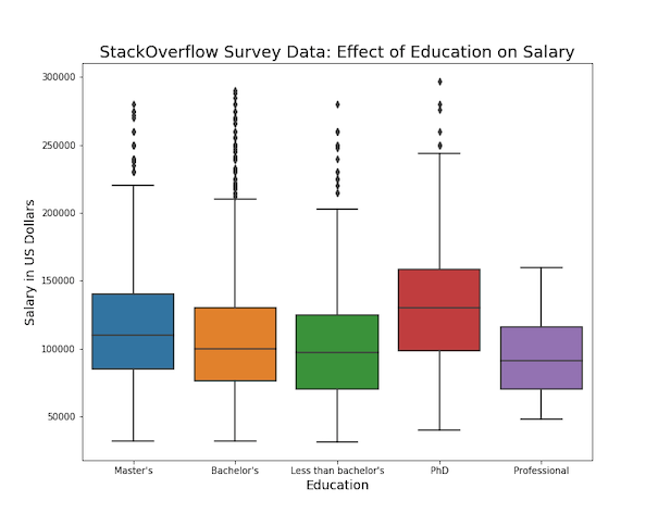
Now we are ready to make boxplots and highllight mean values on the boxplot. We will start with making a simple boxplot using Seaborn’s boxplot function.
plt.figure(figsize=(10, 8))
sns.boxplot(x="Education",
            y="CompTotal",
            data=data)
plt.ylabel("Salary in US Dollars", size=14)
plt.xlabel("Education", size=14)
plt.title("StackOverflow Survey Data: Effect of Education on Salary", size=18)
plt.savefig("simple_boxplot_with_Seaborn_boxplot_Python.png")
We get a nice boxplot automatically filled with colors by Seaborn. We can see the median values as line in the box.
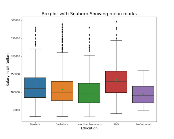
How to Show mean marks on Boxplot with Seaborn?
With Seaborn’s boxplot() function, we can add a mark for mean values on the boxplot, using the argument “showmeans=True”.
# figure size
plt.figure(figsize=(10, 8))
# make boxplot with Seaborn with means
# using showmeans=True
sns.boxplot(x="Education",
            y="CompTotal",
            data=data,
            showmeans=True)
plt.ylabel("Salary in US Dollars", size=14)
plt.xlabel("Education", size=14)
plt.title("Boxplot with Seaborn Showing mean marks", size=18)
plt.savefig("show_means_in_boxplot_Seaborn_boxplot_Python.png")
Seaborn’s showmeans=True argument adds a mark for mean values in each box. By default, mean values are marked in green color triangles.
How to Customize mean marks on Boxplot with meanprops in Matplotlib?
Although we have highlighted the mean values on the boxplot, the color choice for mean value does not match well with boxplot colors. It will be great to customize the mean value symbol and color on the boxplot.
We can use Matplotlib’s meanprops to customize anything related to the mean mark that we added. For example, we can change the shape using “marker” argument. With “markerfacecolor” and “markeredgecolor”, we can change the fill color and edge color of the marker. And finally we can change the size of the mean marker with “markersize” option.
plt.figure(figsize=(10, 8))
sns.boxplot(x="Education",
            y="CompTotal",
            data=data,
            showmeans=True,
            meanprops={"marker":"o",
                       "markerfacecolor":"white",
                       "markeredgecolor":"black",
                      "markersize":"10"})
plt.ylabel("Salary in US Dollars", size=14)
plt.xlabel("Education", size=14)
plt.title("Customizing Mean Marks in Boxplot with Seaborn", size=18)
plt.savefig("customize_mean_mark_in_boxplot_Seaborn_boxplot_Python.png")
Now we have customized the mean marker nicely with white color circles on boxplot.

Annotate Numeric Mean Values
Adding the actual mean numbers above each box makes your boxplots presentation-ready. This is especially useful when you want readers to know not just that the mean is different, but by exactly how much.
We’ll look at two ways to do this: ax.text() (simpler) and ax.annotate() (more flexible).
Add mean values to boxplot Using ax.text()
ax.text() is the quickest way to drop text directly onto your plot at a given (x, y) coordinate. The downside is that you need to manually offset the text (for example, adding +2000 to the y-value) so it doesn’t overlap the marker or the box.
# mean per group
means = data.groupby("Education", as_index=False)["CompTotal"].mean()
# make boxplot
plt.figure(figsize=(10,8))
ax = sns.boxplot(x="Education", y="CompTotal", data=data,
                 showmeans=True,
                 meanprops={"marker":"o",
                            "markerfacecolor":"white",
                            "markeredgecolor":"black",
                            "markersize":8})

# add annotations with ax.text()
order = ax.get_xticklabels()
xticks = range(len(order))
for i, tick in zip(xticks, order):
    cat = tick.get_text()
    m = means.loc[means["Education"]==cat, "CompTotal"].values
    if len(m):
        ax.text(i, m[0] + 2000, f"{m[0]:.0f}",
                ha="center", va="bottom",
                fontsize=11, fontweight="bold")
ax.set_ylabel("Salary (USD)", size=16)
ax.set_xlabel("Education", size=16)
ax.set_title("Seaborn Boxplot with Mean Markers and Annotations (ax.text())", size=19)
plt.savefig("Seaborn_Boxplot_with_mean_marker_and_annotations_ax_text.png", dpi=300)
Tip: If your data has very different scales, you may need to adjust the offset (+2000 above) or even compute a percentage offset (like 1–2% of the axis range).

Add mean values to boxplot Using ax.annotate()
ax.annotate() is more powerful. Instead of manually adding to the y-value, you can use the xytext and textcoords="offset points" arguments to shift the label relative to the data point. This keeps your code cleaner and easier to adjust.
plt.figure(figsize=(10,8))
ax = sns.boxplot(x="Education", y="CompTotal", data=data,
                 showmeans=True,
                 meanprops={"marker":"o","markerfacecolor":"white",
                            "markeredgecolor":"black","markersize":8})
for i, tick in zip(xticks, order):
    cat = tick.get_text()
    m = means.loc[means["Education"]==cat, "CompTotal"].values
    if len(m):
        ax.annotate(f"{m[0]:.0f}",
                    (i, m[0]),              # anchor at mean point
                    xytext=(0, 6),          # offset by 6 points upward
                    textcoords="offset points",
                    ha="center", va="bottom",
                    fontsize=11, fontweight="bold",
                    color="black")
ax.set_ylabel("Salary (USD)", size=16)
ax.set_xlabel("Education", size=16)
ax.set_title("Seaborn Boxplot with Mean Markers and Annotations (ax.annotate())", size=19)
plt.savefig("Seaborn_Boxplot_with_mean_marker_and_annotations_ax_annotate.png", dpi=300)

This approach is generally better for reusable code and when you don’t want to hard-code offsets for different datasets.
– Use
ax.text() if you just need a quick label and can manually set the offset.– Use
ax.annotate() if you want more control and cleaner, dataset-independent code.– Both methods produce identical results visually — the difference is in flexibility.
FAQs
Does Seaborn show the mean by default?
No. Seaborn shows the median line by default. Use showmeans=True to add mean markers.
How can I customize the mean marker?
Pass a dictionary to meanprops to adjust marker shape, color, and size.
Can I show both a mean marker and numeric label?
Yes, use showmeans=True for the marker, and add numeric labels with ax.text() or ax.annotate().
What’s the difference between Seaborn and Matplotlib approaches?
Seaborn adds mean markers. Matplotlib can draw horizontal mean lines across boxes with meanline=True.
Why do I sometimes need to adjust text label offsets manually?
When you use ax.text() to place mean labels, you usually add a fixed offset to the y-value (for example, mean + 2000). This works fine if your data is on a similar scale (e.g. salaries between 30k–200k). But if your dataset changes scale (e.g. test scores 0–100, or revenues in millions), that fixed number may be too big or too small — the labels might overlap the marker or be pushed far off the chart. This is called a hard-coded offset.
Using ax.annotate() avoids this problem. Instead of adding a fixed offset to the data, you can specify a relative offset in points (pixels) with xytext and textcoords="offset points". For example:
# Hard-coded offset (depends on data scale)
ax.text(i, mean_value + 2000, f"{mean_value:.0f}")

# Scale-independent offset (works on any dataset)
ax.annotate(f"{mean_value:.0f}",
            (i, mean_value),
            xytext=(0, 6), textcoords="offset points")
Tip: Use ax.text() for quick plots you control, and ax.annotate() when you want more robust, reusable code that adapts to different scales.