Last updated on June 16, 2022
In this tutorial, we will use Seaborn and learn how to make a scatterplot between two quantitative variables with marginal density plots on the sides.
We will use Seaborn’s JointGrid() to define the features of the plot and then add scatter plot on top first and then add marginal density plots as marginal. This strategy of building layers of plot is useful in types of marginal plots as well. Check out here to learn how to make scatter plot with boxplot on the marginals.
Let us get started by loading the packages needed.
# impor matplotlib
import matplotlib.pyplot as plt
# import pandas
import pandas as pd
# import seaborn
import seaborn as sns
We will use Palmer penguins data to make the scatterplot with marginal density plot. We will load the data directly from datavizpyr’s github page.
penguins_data="https://raw.githubusercontent.com/datavizpyr/data/master/palmer_penguin_species.tsv"
# load penguns data with Pandas read_csv
penguins_df = pd.read_csv(penguins_data, sep="\t")
Plotting with Seaborn JointGrid() function
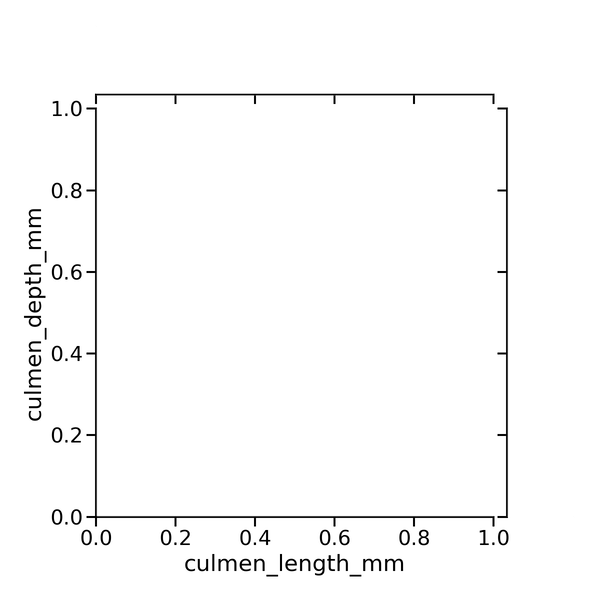
Seaborn’s JointGrid is a powerful function that can be used build layers of plot. We will start with using JointGrid() to make basic plot outline. We specify data, x and y-axis variables and it creates an empty plot as shown below.
g = sns.JointGrid(data=penguins_df,
                  x="culmen_length_mm",
                  y="culmen_depth_mm",
                  height=8,
                  ratio=5)
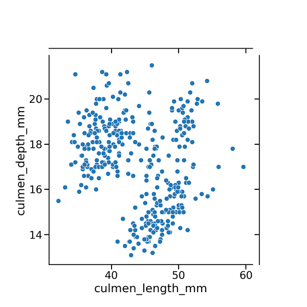
Let us add scatterplot to the layout using Seaborn’s scatterplot function. We use plot_joint() function and specify the scatterplot function name as argument.
# add scatter plot layer
g.plot_joint(sns.scatterplot)
It gives us the scatterplot with empty space for the marginals.
Next, we will add marginal density plot using Seaborn’s kdeplot function. We specify kedplot function as argument to Seaborn’s plot_marginal() function to make the marginal density plot.
# add marginal density plot layer
g.plot_marginals(sns.kdeplot)
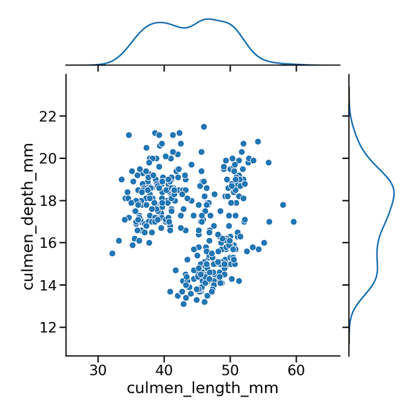
Seaborn JointGrid(): Scatter plot with marginal density plot()
We saw step-by-step tutorial on how to make scatterplot with marginal density plot. Here are three statements together to make scatterplot with marginal density plot using Seaborn in Python.
# setup the plot with JointGrid
g = sns.JointGrid(data=penguins_df,
                  x="culmen_length_mm",
                  y="culmen_depth_mm",
                 height=8, ratio=5)
# add scatter plot
g.plot_joint(sns.scatterplot)
# add marginal density plot layer
g.plot_marginals(sns.kdeplot)