Last updated on August 25, 2025
Seaborn picks sensible default colors when you map a variable to hue, but real projects often need more control—consistent brand colors across plots, color-blind–friendly choices, or publication-ready figures. This hands-on tutorial shows exactly how to change colors in Seaborn, with clear, reproducible examples you can copy-paste.
What you’ll learn, step by step:
- Apply Seaborn’s built-in palettes (e.g.,
"Set2","colorblind","Dark2") - Pass a custom list of colors (order-sensitive)
- Map categories to colors with a dictionary (order-agnostic, stable across plots)
- Use hex codes/brand palettes for reports and style guides
- Handle numeric
huewith continuous colormaps (e.g.,"viridis") - Set a global default palette for consistency across your session
We’ll use Seaborn’s penguins dataset so you can run everything as-is. Each section includes a short explanation, a minimal code example, and a saved figure—so you can adapt the pattern to your own data immediately.
👉 Want more? Explore the full Seaborn Tutorial Hub with 35+ examples, code recipes, and best practices.
Setup & Data
We’ll use the Penguin dataset (built into Seaborn) and keep Matplotlib imports minimal. All examples are reproducible.
import pandas as pd
import seaborn as sns
import matplotlib.pyplot as plt

# Load data
penguins = sns.load_dataset("penguins")

# A clean default style
sns.set_theme(style="whitegrid", context="talk")
Quick Start: Default Colors
Seaborn automatically selects a palette when you map a variable to hue. This default is great for quick exploration and ensures high baseline readability. In this section, you’ll see how Seaborn colors categories without any extra configuration.
Understanding the default behavior is helpful because each customization method we apply later—built-in palettes, lists, dictionaries, or hex codes—replaces or extends this default. Start here to confirm your plot is rendering correctly before tuning colors.
plt.figure(figsize=(9,7))
sns.scatterplot(
    data=penguins,
    x="flipper_length_mm", y="bill_length_mm",
    hue="species", size="body_mass_g"
)
plt.title("Seaborn default colors")
plt.tight_layout()
plt.show()

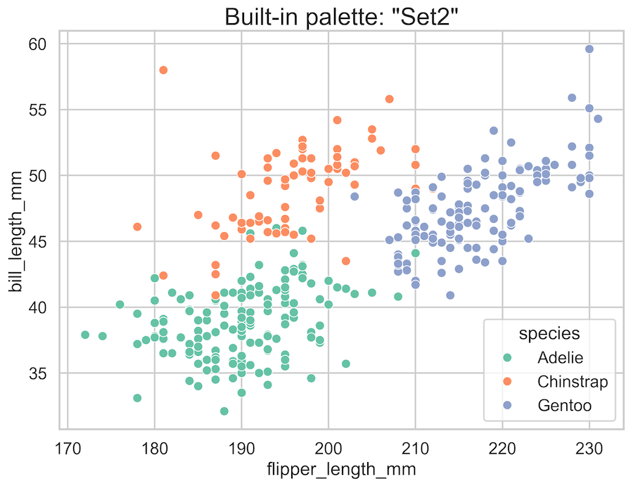
Method 1 — Use Built-in Palettes
Built-in palettes provide a fast, consistent way to change colors without memorizing hex codes. You can pass strings like "Set2", "Paired", "Dark2", or "colorblind" to the palette argument. These palettes are curated to balance distinctiveness and aesthetics.
Use them for prototypes, dashboards, or whenever you want a cohesive look with minimal effort. This method preserves category order and scales well for small-to-moderate numbers of classes.
For quick brand-agnostic styling, use named palette string (e.g., "Set2", "Paired", "Dark2", "colorblind").
plt.figure(figsize=(9,7))
sns.scatterplot(
    data=penguins,
    x="flipper_length_mm", y="bill_length_mm",
    hue="species",
    palette="Set2"   # try "Dark2", "Paired", "colorblind"
)
plt.title('Built-in palette: "Set2"')
plt.tight_layout()
plt.show()
Method 2 — Pass a Custom List of Colors
A custom list is the simplest way to impose your preferred colors—using named colors or hex codes. It’s ideal when you know the exact order of categories as Seaborn encounters them.
The first color maps to the first category, the second to the next, and so on. This approach is compact and explicit, but order-sensitive: if your category order changes due to filtering or sorting, the color-to-category mapping may shift unexpectedly. For stable mapping, see the dictionary method.
# Custom list: Matplotlib named colors or hex codes
custom_list = ["#2E86AB", "#E07A5F", "#6A4C93"]  # blue, salmon, purple

plt.figure(figsize=(9,7))
sns.scatterplot(
    data=penguins,
    x="flipper_length_mm", y="bill_length_mm",
    hue="species",
    palette=custom_list   # order matters
)
plt.title("Custom list palette (order-sensitive)")
plt.tight_layout()
plt.show()

Method 3 — Map Categories to Colors with a Dictionary
A dictionary mapping (category → color) is the most robust way to control colors for categorical data. It guarantees that “Adelie” is always the same color, regardless of sorting, filtering, or factor order.
Using dictionary mapping makes your figures consistent across notebooks, reports, and dashboards. Use readable Matplotlib names (e.g., "tab:orange") or hex codes. As your project grows, keep this palette mapping in a shared module to enforce brand consistency and avoid accidental palette drift.
palette = {
    "Adelie":    "tab:cyan",
    "Chinstrap": "tab:purple",
    "Gentoo":    "tab:orange"
}

plt.figure(figsize=(9,7))
sns.scatterplot(
    data=penguins,
    x="flipper_length_mm", y="bill_length_mm",
    hue="species",
    size="body_mass_g",
    palette=palette
)
plt.xlabel("Flipper length (mm)")
plt.ylabel("Bill length (mm)")
plt.title("Dictionary mapping: category → color (order-agnostic)")
plt.tight_layout()
plt.show()

Method 4 — Use Hex Codes / Brand Colors
When following brand guidelines or preparing publication-quality figures, hex codes give you precise control. Define a palette using your organization’s primary and secondary colors and apply it via a list or a dictionary.
Hex codes ensure exact reproduction in print and on the web. For best results, verify contrast ratios and test your palette against common color-vision deficiencies. Combine color with shape or marker style for redundant encoding in high-stakes visuals.
brand_palette = {
    "Adelie":    "#1B9E77",  # green
    "Chinstrap": "#D95F02",  # orange
    "Gentoo":    "#7570B3"   # purple
}

plt.figure(figsize=(9,7))
sns.scatterplot(
    data=penguins,
    x="flipper_length_mm", y="bill_length_mm",
    hue="species",
    palette=brand_palette
)
plt.title("Brand/hex colors via dictionary")
plt.tight_layout()
plt.show()

Bonus — Continuous Colormaps for Numeric Hue
If your hue variable is numeric (e.g., body mass), Seaborn automatically switches to a continuous colormap. You can choose alternatives like "viridis", "magma", or "cividis" for better perceptual uniformity and accessibility.
Adjust the mapping range with hue_norm to focus on a meaningful value span. Continuous colormaps are powerful for gradients and density-like patterns, but be mindful of interpretability—legends and clear titles help readers decode the scale quickly.
plt.figure(figsize=(9,7))
sns.scatterplot(
    data=penguins,
    x="flipper_length_mm", y="bill_length_mm",
    hue="body_mass_g",       # numeric hue
    palette="viridis"        # try "magma", "plasma", "cividis"
)
plt.title("Numeric hue with continuous colormap (viridis)")
plt.tight_layout()
plt.show()

Set a Global Default Palette
Use sns.set_palette() to define a session-wide default palette that all subsequent Seaborn plots inherit. This is perfect for multi-figure reports and notebooks where visual consistency matters. You can pass a named palette, a custom list, or even your brand dictionary.
Setting a global palette reduces repeated code, prevents accidental palette changes across figures, and makes your entire analysis look cohesive without micromanaging each plot’s palette argument.
# Apply globally (affects subsequent plots)
sns.set_palette(["#2E86AB", "#E07A5F", "#6A4C93"])

# Example plot will now use the global palette
plt.figure(figsize=(9,7))
sns.scatterplot(
    data=penguins,
    x="flipper_length_mm", y="bill_length_mm",
    hue="species"
)
plt.title("Global default palette via sns.set_palette()")
plt.tight_layout()
plt.show()

Accessibility & Best-Practice Tips
Color choices affect clarity and inclusion. Prefer accessible palettes (e.g., "colorblind"), ensure sufficient contrast, and pair color with shapes or line styles for redundancy. Keep category counts manageable—too many colors overwhelm the reader.
Use consistent mapping across plots, and label important points directly when possible. Finally, export figures at high resolution (e.g., dpi=300) to preserve color fidelity in documents, slides, and print.
-
Color-blind friendly: Prefer palettes like
"colorblind"or choose colors with sufficient contrast. - Consistency: Use a dictionary mapping in shared code so colors don’t change when data order changes.
- Label clarity: Pair color with labels, shapes, or line styles—redundant encoding improves readability.
-
Export quality: Save high-res images for reports:
plt.savefig("figure.png", dpi=300, bbox_inches="tight").
Common Pitfalls & Fixes
Common issues include order-sensitive lists that remap colors unexpectedly, palettes that wash out due to low alpha, and inconsistent colors across figures. Switch to a dictionary for stable mapping, increase legend alpha, and consider a global palette with sns.set_palette().
For many categories, use larger palettes (e.g., Matplotlib’s tab20) or group rare classes under “Other.” Always verify that your legend accurately reflects both the palette and the data shown.
- Wrong colors to categories: Lists are order-sensitive. If your categories reorder, switch to a dictionary.
-
Colors look washed out: You may be applying
alphaor an overlapping style. Remove or increase alpha for the legend; considerstyle=ormarkers=True. -
Inconsistent colors across plots: Set a global palette with
sns.set_palette()or reuse the same dictionary. -
Too many categories: Choose a larger palette (e.g.,
"tab20"via Matplotlib) or group rare categories under “Other”.
Frequently Asked Questions (FAQs)
This FAQ tackles edge cases and practical decisions that don’t fit the main flow—like choosing color-blind–friendly options, mixing hex and named colors, managing 10+ categories, and enforcing consistent palettes across a project. Use these answers to avoid common traps and make better design choices under real-world constraints.
-
How do I guarantee the same category always uses the same color?
Use a dictionary mapping (category → color). This is order-agnostic and reproducible across plots and sessions. -
Can I mix hex codes and named colors?
Yes. Seaborn/Matplotlib accept both in lists or dictionaries (e.g.,{"A":"#1f77b4","B":"tab:orange"}). -
How do I apply one palette to every plot in my script or notebook?
Callsns.set_palette(...)once after imports to set a session-wide default palette. -
What’s the best palette for color-blind accessibility?
Start with"colorblind"or high-contrast palettes like"Set2". Also consider redundant encodings (shape/size) withstyle=ormarkers=True. -
How do I manage colors when I have 10+ categories?
Use larger palettes (e.g., Matplotlib’stab20) or consolidate rarely used categories. Too many colors hurts readability.


