Last updated on August 22, 2025
In this post we will learn how to increase the gap between boxes in a nested or grouped boxplot made with Seaborn in Python. We will use Seaborn v0.13.0 that came out in September 2023’s feature to increase the gap size.
Let us first load the modules/packages needed to make boxplot and change the gap size between the dodged elements, in this example boxes.
👉 Want more? Explore the full Seaborn Tutorial Hub with 35+ examples, code recipes, and best practices.
import matplotlib.pyplot as plt
import seaborn as sns
import pandas as pd
sns.__version__
0.13.0
We have also checked the loaded Seaborn version to make sure we can use this feature.
First, let us set the plot theme using set_theme() function and also set the plot size using set_context() function in Seaborn.
sns.set_theme(style="whitegrid")
sns.set_context("notebook", font_scale=1.5)
To make the grouped boxplot, we will use Palmer penguin dataset available in Seaborn.
penguins = sns.load_dataset("penguins")
penguins.head()

  species	island	bill_length_mm	bill_depth_mm	flipper_length_mm	body_mass_g	sex
0	Adelie	Torgersen	39.1	18.7	181.0	3750.0	Male
1	Adelie	Torgersen	39.5	17.4	186.0	3800.0	Female
2	Adelie	Torgersen	40.3	18.0	195.0	3250.0	Female
3	Adelie	Torgersen	NaN	NaN	NaN	NaN	NaN
4	Adelie	Torgersen	36.7	19.3	193.0	3450.0	Female
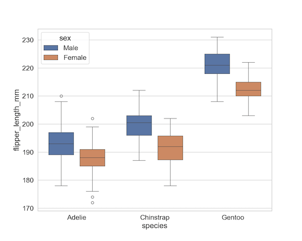
Grouped boxplot or Nested boxplot with Seaborn
We can make a grouped boxplot with Seaborn using boxplot() function and specifying hue argument in addition to x and y arguments.
In the example below we make a boxplot between penguin species and their flipper length and use hue to dodge the boxplot by sex variable.
plt.figure(figsize=(10,8))
sns.boxplot(data = penguins,
           x = "species",
           y = "flipper_length_mm",
           hue = "sex")
plt.savefig("Seaborn_nested_boxplot_with_two_variable.png",
                    format='png',dpi=150)
Notice that, the boxes within a group are close to each other and almost touching.

How to increase the gap between boxes in grouped boxplot or Nested boxplot with Seaborn
We can increase the gap between the boxes in grouped boxplot using the new gap argument in Seabor v0.13.0. In the example below we used gap = 0.2 to increase the gap size.
plt.figure(figsize=(10,8))
sns.boxplot(data = penguins,
           x = "species",
           y = "flipper_length_mm",
           hue = "sex",
           gap = .2)
plt.savefig("Increase_gap_between_boxes_nested_boxplot_Seaborn.png",
                    format='png',dpi=150)