Last updated on August 5, 2020
In this tutorial, we will see how to remove box surrounding title of each facets made with facet_wrap() function in ggplot2.
Let us load tidyverse and set ggplot2 theme_bw() with base size 16. Let us use Palmer penguin dataset to make plots with facets using facet_wrap() in ggplot2. We ill use the palmerpenguins package to get the data. One can also load Penguins data directly from github page.
library(tidyverse)
library(palmerpenguins)
theme_set(theme_bw(16))
penguins %>% head()

## # A tibble: 6 x 8
##   species island bill_length_mm bill_depth_mm flipper_length_… body_mass_g sex
##   <fct>   <fct>           <dbl>         <dbl>            <int>       <int> <fct>
## 1 Adelie  Torge…           39.1          18.7              181        3750 male
## 2 Adelie  Torge…           39.5          17.4              186        3800 fema…
## 3 Adelie  Torge…           40.3          18                195        3250 fema…
## 4 Adelie  Torge…           NA            NA                 NA          NA <NA>
## 5 Adelie  Torge…           36.7          19.3              193        3450 fema…
## 6 Adelie  Torge…           39.3          20.6              190        3650 male
## # … with 1 more variable: year <int>
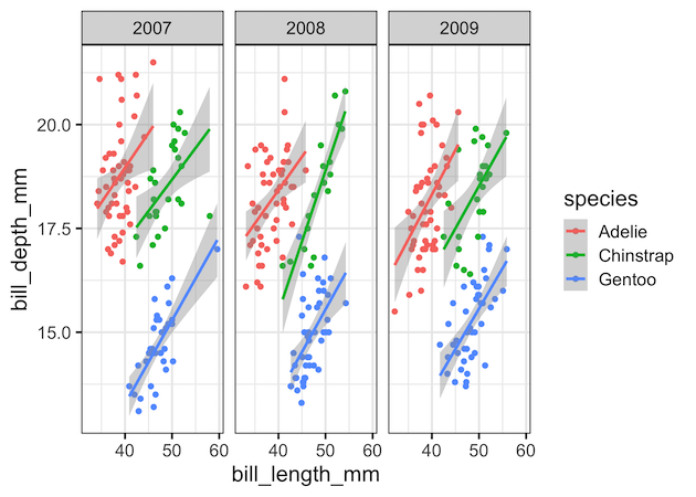
facet_wrap() example with default grey title box
Let us make a scatter plot between Penguin’s bill length vs depth with year as faceting variable. We also add color to species variable
penguins %>%
  ggplot(aes(x=bill_length_mm,
             y=bill_depth_mm,
             color=species))+
  geom_point()+
  geom_smooth(method = "lm")+
  facet_wrap(~year)
ggsave("customize_facet_wrap_ggplot2.png")
By default, ggplot2 creates the values of the faceting variable, in this example year, as title for each facetted plot in grey color box.
removing facet_wrap()’s grey title box
We can customize the facet_wrap() plot by removing the grey box altogether using theme() function. theme() function in ggplot2 is a versatile function to customize the look of a plot made with ggplot2. To remove the grey box, we need to specify “strip.background = element_blank()” as argument to theme() function.
penguins %>%
  ggplot(aes(x=bill_length_mm,
             y=bill_depth_mm,
             color=species))+
  geom_point()+
  geom_smooth(method = "lm")+
  facet_wrap(~year)+
  theme(strip.background = element_blank())
ggsave("facet_wrap_without_box_ggplot2.png")
Voila, now the default grey box is gone in each facet. And the title for each facet is much simple now.
 to remove box")
Do you want to keep the box, but change the default grey color? Check out this post, How To Change facet_wrap() Box Color in ggplot2? to learn how strip.background is useful to change color.