Violinplots are a great alternative to boxplot, as it combines boxplot and density plot. In this tutorial, we will see examples of how to make violinplots with using ggplot2’s geom_violin() function. Violinplots are like boxplot for visualizing numerical distributions for multiple groups. In comparison to boxplot, Violin plot adds information about density of distributions to the plot. A grouped violin plot is great for visualizing multiple grouping variables.
Let us load tidyverse and set ggplot2 theme_bw() with base size 16.
library(tidyverse)
theme_set(theme_bw(16))
We will use Palmer penguin dataset to make grouped violinplot with ggplot2 in R. Let us load the data directly from github page.
p2data <- "https://raw.githubusercontent.com/datavizpyr/data/master/palmer_penguin_species.tsv"
penguins_df <- read_tsv(p2data)
Let us make a simple violinplot with fill colors using geom_violin() function in ggplot2.
penguins_df %>%
  ggplot(aes(x=species,
             y=flipper_length_mm,
             fill=species))+
  geom_violin()
ggsave("Simple_Violinplot_ggplot2_R.png")
With fill argument, ggplot2 automatically fills the violinplot with colors for each value of the fill variable.

Adding data points to Violinplot with geom_point()
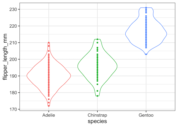
Let us add data points to the violin plot adding the geom_point() function as additional layer to the plot.
penguins_df %>%
  ggplot(aes(x=species,
             y=flipper_length_mm,
             color=species))+
  geom_violin()+
  geom_point()+
  theme(legend.position = "none")
ggsave("Violinplot_with_datapoints_ggplot2_R.png")
Now our plot displays the actual data points overlayed on the violinplot. However, you can see that all data points are lined in the middle of the violin plot. This can be a n issue when many data points overlap on each other.
How to Add Jittered Data Points to Violinplot in ggplto2?
Let us improve our violinplot with data points using random noise to the actual datapoints on the x-axis. This idea is called adding “jitters”. And with ggplot2, we can add jittered data points using geom_jitter() function. In this example we have added geom_jitter() instead of geom_point() as an additional layer to geom_violin()
penguins_df %>%
  ggplot(aes(x=species, y=flipper_length_mm, fill=species))+
  geom_violin()+
  geom_jitter()+
  theme(legend.position = "none")
ggsave("Violinplot_with_datapoints_jittered_ggplot2_R.png")
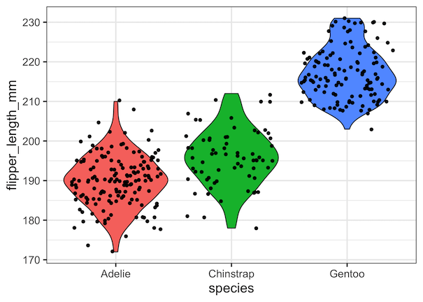
How to Specify jitter width to Violinplot in ggplto2?
Violin plot with jittered data points using geom_jitter() looks okay. We can make it better by customizing the width of the jitter. Here we we use width=0.15 to make the width smaller and also specify transparency of data points with alpha=0.5 argument to geom_jitter().
penguins_df %>%
  ggplot(aes(x=species, y=flipper_length_mm, fill=species))+
  geom_violin()+
  geom_jitter(width=0.15, alpha=0.5)+
  theme(legend.position = "none")
ggsave("Violinplot_with_jittered_ggplot2_R.png")
Now we have a better looking violin plot with jittered data points.