ECDF plot, a short for Empirical Cumulative Distribution Function Plot, is a great way to visualize one or more distributions. ECDF plot is a great alternative for histograms, as it does not suffer from the need of tuning parameter (bin size in histogram is a tuning parameter) and it can show the full range of data clearly.
In this post, we will learn how to make ECDF plot using ggplot2 in R.
Let us load tidyverse and set the theme for plots.
library(tidyverse)
theme_set(theme_bw(16))
We will simulate data from normal distribution and save it in dataframe. In the example, we have generated data from four distributions. We have also created group identity variable using gl() function.
# create data frame with four distributions and their group names
df <- data.frame( x = c(rnorm(100, 0, 5),
                        rnorm(100, 0, 10),
                        rnorm(100, 0, 20),
                        rnorm(100, 0, 30)),
                  group = gl(4, 100))
Our data looks like and we are ready to make ECDF plot.
head(df)
##            x group
## 1  6.8113116     1
## 2 -2.2379359     1
## 3 -0.4317104     1
## 4 -3.1450340     1
## 5  6.3070881     1
## 6 -6.6944831     1
Simple ECDF plot
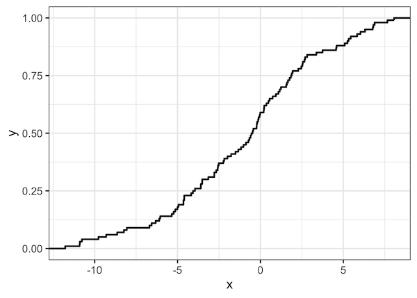
Let us start with a simple ECDF plot. Here we make ECDF plot of one distribution. Since our data contains data from 4 distribution, we filter for one group below.
We can make ECDF plot in ggplot2 using stat_ecdf() function.
# Simple ECDF plot
df %>%
  filter(group=="1") %>%
  ggplot(aes(x=x)) +
  stat_ecdf(size=1)
And we get ECDF plot like this. On the x-axis you have the data and its range of the distribution we are plotting. On the y-axis we have the percentage of data for given x value. For example, when x value is 5, we can see that close 80% of the data has values below 5.
ECDF plot of Multiple Distributions
ECDF plot is extremely useful when plotting multiple distributions. In the example below we make ECDF plot with four distributions.
# ECDF plots of four distributions
df %>%
  ggplot(aes(x=x,col=group))+
  stat_ecdf(size=1)
ggsave("ECDF_Empirical_Cumualtive_Distribution_Function_plot_ggplot2.png")
And the ECDF plot of multiple distributions can clearly show the difference/similarity between the distributions.


