A boxplot is one of the simplest ways to summarize and visualize a distribution. Boxplots have been around for close to 50 years. The earliest form of Boxplot was invented by Mary Eleanor Spear as range plot and then John Tukey created box-and-whisker plot that uses quartiles of a distribution draw a box and whiskers. As Hadley Wickham nicely explains in a paper titled 40 years of boxplots
Boxplots use robust summary statistics that are always located at actual data points, are quickly computable (originally by hand), and have no tuning parameters. They are particularly useful for comparing distributions across groups.
In this post, we will see how to make simple boxplots using ggplot2 package in R.
Let us load tidyverse, a suite of R packages including ggplot2 for making boxplots.
library(tidyverse)
Let us simulate some data to make boxplots. Here, we simulate height data for two groups. The function tibble creates dataframe like data structure containing the data.
set.seed(23)
n <- 50
df <- tibble(height = c(rnorm(n,mean=150,sd=10),
                        rnorm(n,mean=100,sd=20) ),
             age_group = c(rep("Adult", n),
                           rep("Kid", n)))
And the simulated data looks like this.
## # A tibble: 6 x 2
##   height age_group
##    <dbl> <chr>
## 1   152. Adult
## 2   146. Adult
## 3   159. Adult
## 4   168. Adult
## 5   160. Adult
## 6   161. Adult
Let us make a boxplot using ggplot2. In ggplot2, we first provide the data to ggplot2 function and then specify aesthetics i.e. the x and y axis variables needed to be plotted. In our example, we use pipe operator %>% to provide data to ggplot function.
After specifying aesthetics, we use geome_boxplot() function to make boxplot with ggplot2. To make the boxplot more legible and better looking, we use the black and white ggplot2 theme with base label size 16.
df %>% ggplot(aes(x=age_group, y=height)) +
  geom_boxplot() +
  theme_bw(base_size=16)
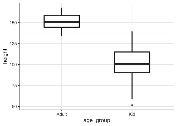
And this is how the simple boxplot we made looks like.
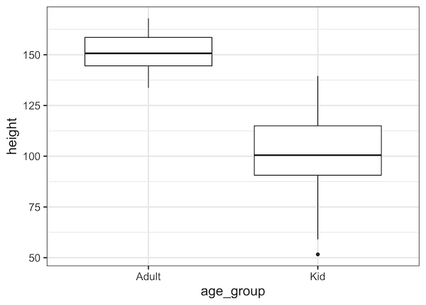
The above boxplot looks great. However, a number of things could be changed to make it look better. The boxes in boxplot are wider. Let us change the width of boxplot using the width argument inside geom_boxplot()
df %>% ggplot(aes(x=age_group, y=height)) +
  geom_boxplot(width=0.5) +
  theme_bw(base_size=16)
Now the boxes in the boxplot is thinner as we wanted.
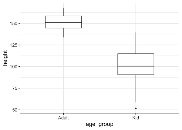
Now, the line drawing the boxplot is thinner. Let us change thickness of line, i.e. line width, of the boxplot using the argument “lwd” (short for line width)
df %>% ggplot(aes(x=age_group, y=height)) +
  geom_boxplot(width=0.5, lwd=1.5) +
  theme_bw(base_size=16)
Now the lines around the box is thicker with the median line inside the box more pronounced.
To summarize, in this post, we have seen examples of how to make a simple boxplot using ggplot2 in R and customize boxplot widths and thickness of line making the boxplot.