Last updated on January 29, 2020
In this post, we will learn how to make grouped boxplots in Python using Seaborn’s boxplot function. Grouped boxplots are a great way to visualize when you have three variables, where one of them is a numerical variable and the other two are categorical variables.
Let us load the packages needed to make grouped boxplot with Seaborn in Python.
import seaborn as sns
import matplotlib.pyplot as plt
import pandas as pd
We will be using StackOverflow Survey 2019 data to make a grouped boxplot using Seaborn. The processed data is at datavizpyr.com‘s github page.
data_url="https://raw.githubusercontent.com/datavizpyr/data/master/SO_data_2019/StackOverflow_survey_filtered_subsampled_2019.csv"
data = pd.read_csv(data_url)
We will be using three variables from the survey data; Salary per annum in US dollars, gender and Education. The variable “CompTotal” is Salary/ total compensation in the survey data.
print(data.head(3))

   CompTotal Gender Manager YearsCode Age1stCode YearsCodePro   Education
0   180000.0    Man      IC        25         17           20    Master's
1    55000.0    Man      IC         5         18            3  Bachelor's
2    77000.0    Man      IC         6         19            2  Bachelor's
Let us filter the dataset to remove outliers and consider individuals who are individual contributers. We use Pandas’ query() function to filter rows based on values of other columns.
data_df=data.query('Manager=="IC"')
data_df=data_df.query('CompTotal<300000 & CompTotal>30000')
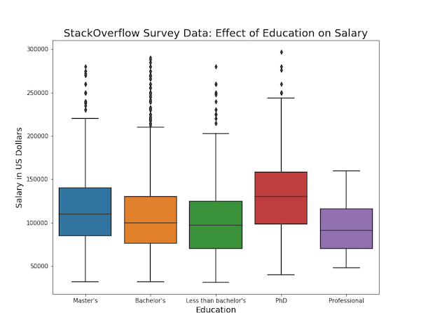
If we have just two variables; one numerical- Salary and one categorical – Education, we can make a boxplot to visualize the distributions of salary for different education level.
We use Seaborn’s boxplot() function to make the simple boxplot with education on x-axis and salary on y-axis.
plt.figure(figsize=(10, 8))
# make boxplot with Seaborn
sns.boxplot(x="Education", y="CompTotal", data=data_df)
# Set labels and title
plt.ylabel("Salary in US Dollars", size=14)
plt.xlabel("Education", size=14)
plt.title("StackOverflow Survey Data: Effect of Education on Salary", size=18)
plt.savefig("simple_boxplot_Seaborn_boxplot_Python.png")
Grouped Boxplot with Seaborn’s boxplot() function
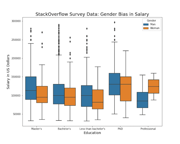
We can make grouped boxplot to visualize the relationship of three variables. In this example, we make grouped boxplot to see how gender affects salary for each education category.
With Seaborn’s boxplot() function we can make grouped boxplot by using the argument hue and specifying the categorical variable that we want to group-by.
In this example, we specify hue=”Gender” as it is the third variable of interest.
plt.figure(figsize=(10, 8))
sns.boxplot(x="Education", y="CompTotal", hue='Gender',data=data_df)
plt.ylabel("Salary in US Dollars", size=14)
plt.xlabel("Education",size=14)
plt.title("StackOverflow Survey Data: Gender Bias in Salary", size=18)
plt.savefig("grouped_boxplot_Seaborn_boxplot_Python.png")
The grouped boxplot made with Seaborn is clearly informative as we can see the gender bias in salary with in the same educational categories.