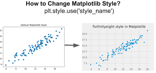
In this tutorial, we will learn how to change the background theme or style of a plot made with matplotlib. Matplotlib offers a number of ready to use styles to use for matplotlib plots. We will first learn how to find the available style options and then learn to set a matplotlib style of interest to a plot.
Let us get started with loading the modules needed for making a plot with matplotlib. Matplotlib’s styles can be used after importing style from matplotlib.
import matplotlib.pyplot as plt
import numpy as np
from matplotlib import style
How to list all available matplotlib styles
Matplotlib has over 20 different styling options for making matplotlib plots. By using plt.style.available statement we can print all available styles.
print(plt.style.available)

['Solarize_Light2', '_classic_test_patch', 'bmh', 'classic', 'dark_background', 'fast', 'fivethirtyeight', 'ggplot', 'grayscale', 'seaborn', 'seaborn-bright', 'seaborn-colorblind', 'seaborn-dark', 'seaborn-dark-palette', 'seaborn-darkgrid', 'seaborn-deep', 'seaborn-muted', 'seaborn-notebook', 'seaborn-paper', 'seaborn-pastel', 'seaborn-poster', 'seaborn-talk', 'seaborn-ticks', 'seaborn-white', 'seaborn-whitegrid', 'tableau-colorblind10']
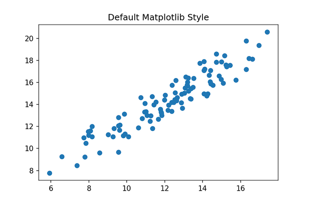
By default, Matplotlib uses “default” style. Here we will learn how to change the default matplotlib style of a scatter plot made with matplotlib. We will generate data for making a scatter plot using Numpy’s random module.
from numpy.random import default_rng
rng = default_rng()
x = rng.normal(12.0, 3, 100)
y = x + rng.normal(2,1,100)
To make scatter plot in Matplotlib, we use scatter() function.
plt.scatter(x,y)
plt.xlabel("x",
            size=14)
plt.ylabel("y",
            size=14)
plt.title("Default Matplotlib Style Scatter plot")
plt.savefig("Default_matplotlib_style_scatterplot.png",
                    format='png',dpi=150)
Our scatter plot made with default matplotlib style looks like.
Changing Matplotlib Style using plt.style.use: Example 1
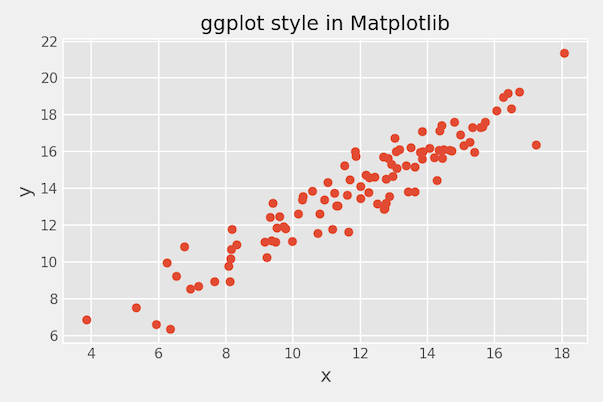
We can change matplotlib’s style using plt.style.use() function. Here we change the theme to ggplot2 style.
plt.style.use('ggplot')
plt.scatter(x,y)
plt.xlabel("x",
            size=14)
plt.ylabel("y",
            size=14)
plt.title("ggplot style in Matplotlib")
plt.tight_layout()
plt.savefig("Change_matplotlib_style_to_ggplot_scatterplot.png",
                    format='png',dpi=150)
Changing Matplotlib Style using plt.style.use: Example 2
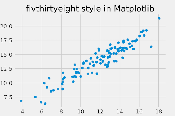
Here is another example, where we change Matplotlib plotting style to fivethirtyeight style.
plt.style.use('fivethirtyeight')
plt.scatter(x,y)
plt.xlabel("x",
            size=14)
plt.ylabel("y",
            size=14)
plt.title("fivthirtyeight style in Matplotlib")
plt.savefig("Change_matplotlib_style_scatterplot_to_538.png",
                    format='png',dpi=150)