• Skip to primary navigation
  • Skip to main content
  • Skip to primary sidebar

Data Viz with Python and R

Learn to Make Plots in Python and R

  • Home
  • Python Viz
  • Seaborn
  • Altair
  • R Viz
  • ggplot2
  • About
    • Privacy Policy
  • Show Search
Hide Search

Tidytuesday data

How To Make Ridgeline Plot with ggridges in R?

datavizpyr · February 28, 2020 ·

How to Order Ridgeline Plot?

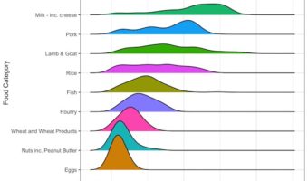
Ridgeline plot is one of the data visualization techniques that is suitable for visualizing multiple distributions or changes in distributions over time or space. Claus Wilke made created this plot and a package in R to make this easily. He defines it as a partially overlapping … [Read more...] about How To Make Ridgeline Plot with ggridges in R?

Filed Under: R, Ridgeline Plot ggridges, Tidytuesday data Tagged With: ggplot2, ggridges, R

Primary Sidebar

Tags

Altair barplot Boxplot boxplot python boxplot with jiitered text labels Bubble Plot Color Palette Countplot Density Plot Facet Plot gganimate ggplot2 ggplot2 Boxplot ggplot2 error ggplot boxplot ggridges ggtext element_markdown() Grouped Barplot R heatmap heatmaps Histogram Histograms Horizontal boxplot Python lollipop plot Maps Matplotlib Pandas patchwork pheatmap Pyhon Python R RColorBrewer reorder boxplot ggplot Ridgeline plot Scatter Plot Scatter Plot Altair Seaborn Seaborn Boxplot Stock Price Over Time Stripplot UpSetR Violinplot Violin Plot World Map ggplot2

Buy Me a Coffee

Copyright © 2025 · Daily Dish Pro on Genesis Framework · WordPress · Log in

Go to mobile version