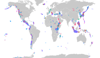
In this post, we will learn how to make world map using ggplot2 in R. We will use geom_map() function to make map with ggplot2. And then we will see an example of overlaying data on the world map. To overlay, we will use volcano eruption data from TidyTuesday project to … [Read more...] about How To Make World Map with ggplot2 in R?
R
How To Make Simple Animation in R?
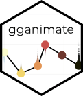
In this post, we will learn to make simple animation in R using gganimate package. gganimate R package is a powerful package to make animation using R. gganimate extends the grammar of graphics as implemented by ggplot2 to include the description of animation. It does this … [Read more...] about How To Make Simple Animation in R?
How To Make Scatter Plot with Regression Line with ggplot2 in R?
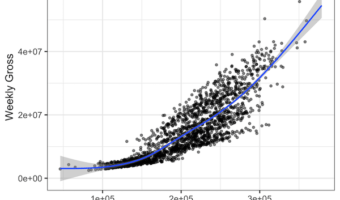
Adding regression line to scatter plot can help reveal the relationship or association between the two numerical variables in the scatter plot. With ggplot2, we can add regression line using geom_smooth() function as another layer to scatter plot. In this post, we will see … [Read more...] about How To Make Scatter Plot with Regression Line with ggplot2 in R?
How To Make Facet Plot using facet_wrap() in ggplot2?
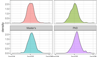
When you have data for a variable corresponding to multiple groups, visualizing the data for each group can be useful. One of the techniques to use is to visualize data from multiple groups in a single plot. However, a better way visualize data from multiple groups is to use … [Read more...] about How To Make Facet Plot using facet_wrap() in ggplot2?
How To Adjust Title Position in ggplot2 ?

One of the annoying things while making a plot is fine tuning it the way you want. Sometimes ones of such pain points is placing the title on the plot. Till recently, ggplot2 placed title or subtitle such that it aligns with the plotting area. In this post we will learn how to … [Read more...] about How To Adjust Title Position in ggplot2 ?