• Skip to primary navigation
  • Skip to main content
  • Skip to primary sidebar

Data Viz with Python and R

Learn to Make Plots in Python and R

  • Home
  • Python Viz
  • Seaborn
  • Altair
  • R Viz
  • ggplot2
  • About
    • Privacy Policy
  • Show Search
Hide Search

heatmaps with pheatmap

How to Make Heatmaps in R with pheatmap?

datavizpyr · October 2, 2020 ·

Heatmap with pheatmap: Clustering columns

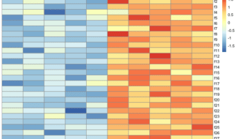
Heatmaps are one of the ways to visualize quantitative data in two dimension. Heatmaps show the actual data as colors and can reveal common patterns easily. In R, there are multiple ways to make heatmap starting from data in matrix form. In this post, we will learn how to make … [Read more...] about How to Make Heatmaps in R with pheatmap?

Filed Under: heatmaps with pheatmap, R Tagged With: heatmaps, pheatmap

Primary Sidebar

Tags

Altair barplot Boxplot boxplot python boxplot with jiitered text labels Bubble Plot Color Palette Countplot Density Plot Facet Plot gganimate ggplot2 ggplot2 Boxplot ggplot2 error ggplot boxplot ggridges ggtext element_markdown() Grouped Barplot R heatmap heatmaps Histogram Histograms Horizontal boxplot Python lollipop plot Maps Matplotlib Pandas patchwork pheatmap Pyhon Python R RColorBrewer reorder boxplot ggplot Ridgeline plot Scatter Plot Scatter Plot Altair Seaborn Seaborn Boxplot Stock Price Over Time Stripplot UpSetR Violinplot Violin Plot World Map ggplot2

Buy Me a Coffee

Copyright © 2025 · Daily Dish Pro on Genesis Framework · WordPress · Log in

Go to mobile version