• Skip to primary navigation
  • Skip to main content
  • Skip to primary sidebar

Data Viz with Python and R

Learn to Make Plots in Python and R

  • Home
  • Python Viz
  • Seaborn
  • Altair
  • R Viz
  • ggplot2
  • About
    • Privacy Policy
  • Show Search
Hide Search

Scatterplot with marginal densityplot

How to Make Scatterplot with Marginal Density Plots with Seaborn

datavizpyr · November 24, 2020 ·

Scatterplot with marginal densityplot with Seaborn

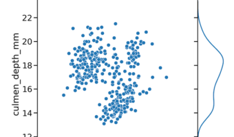
In this tutorial, we will use Seaborn and learn how to make a scatterplot between two quantitative variables with marginal density plots on the sides. We will use Seaborn's JointGrid() to define the features of the plot and then add scatter plot on top first and then add … [Read more...] about How to Make Scatterplot with Marginal Density Plots with Seaborn

Filed Under: Python, Scatterplot with marginal densityplot, Seaborn JointGrid Tagged With: Python, Scatter plot with marginal density plot, Seaborn

Primary Sidebar

Tags

Altair barplot Boxplot boxplot python boxplot with jiitered text labels Bubble Plot Color Palette Countplot Density Plot Facet Plot gganimate ggplot2 ggplot2 Boxplot ggplot2 error ggplot boxplot ggridges ggtext element_markdown() Grouped Barplot R heatmap heatmaps Histogram Histograms Horizontal boxplot Python lollipop plot Maps Matplotlib Pandas patchwork pheatmap Pyhon Python R RColorBrewer reorder boxplot ggplot Ridgeline plot Scatter Plot Scatter Plot Altair Seaborn Seaborn Boxplot Stock Price Over Time Stripplot UpSetR Violinplot Violin Plot World Map ggplot2

Buy Me a Coffee

Copyright © 2025 · Daily Dish Pro on Genesis Framework · WordPress · Log in

Go to mobile version