• Skip to primary navigation
  • Skip to main content
  • Skip to primary sidebar

Data Viz with Python and R

Learn to Make Plots in Python and R

  • Home
  • Python Viz
  • Seaborn
  • Altair
  • R Viz
  • ggplot2
  • About
    • Privacy Policy
  • Show Search
Hide Search

Rolling average time series plot

How to Make a Time Series Plot with Rolling Average in Python?

datavizpyr · May 18, 2020 ·

Time Series Plot with 7-day rolling average

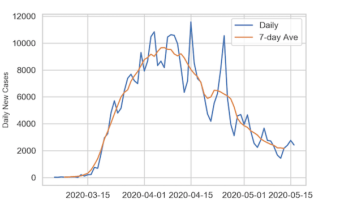
Time Series plots are a great way to see a trend over a period of time. However, if the numerical variable that we are plotting in time series plot fluctuates day to day, it is often better to add a layer moving average to the time series plot. In this post, we will see … [Read more...] about How to Make a Time Series Plot with Rolling Average in Python?

Filed Under: Python, Rolling average time series plot, Seaborn moving average Tagged With: Python, Seaborn

Primary Sidebar

Tags

Altair barplot Boxplot boxplot python boxplot with jiitered text labels Bubble Plot Color Palette Countplot Density Plot Facet Plot gganimate ggplot2 ggplot2 Boxplot ggplot2 error ggplot boxplot ggridges ggtext element_markdown() Grouped Barplot R heatmap heatmaps Histogram Histograms Horizontal boxplot Python lollipop plot Maps Matplotlib Pandas patchwork pheatmap Pyhon Python R RColorBrewer reorder boxplot ggplot Ridgeline plot Scatter Plot Scatter Plot Altair Seaborn Seaborn Boxplot Stock Price Over Time Stripplot UpSetR Violinplot Violin Plot World Map ggplot2

Buy Me a Coffee

Copyright © 2025 · Daily Dish Pro on Genesis Framework · WordPress · Log in

Go to mobile version