• Skip to primary navigation
  • Skip to main content
  • Skip to primary sidebar

Data Viz with Python and R

Learn to Make Plots in Python and R

  • Home
  • Python Viz
  • Seaborn
  • Altair
  • R Viz
  • ggplot2
  • About
    • Privacy Policy
  • Show Search
Hide Search

Python

How To Use Seaborn Color Palette to Color Boxplot

datavizpyr · February 21, 2020 ·

Boxplot with Color Palette Set3 Seaborn

Adding right set of colors to plot can reveal a pattern that is not seen before. Seaborn Color Palettes makes it really easy to add group of suitable colors to your data visualization. In this post, we will learn how to use Seaborn Color Palettes to color a boxplot made with … [Read more...] about How To Use Seaborn Color Palette to Color Boxplot

Filed Under: Python, Seaborn Tagged With: color palette boxplot python, python boxplot specify colors

How To Manually Order Boxplot in Seaborn?

datavizpyr · February 20, 2020 ·

How To Manually Order Boxplot with Seaborn?

In this post we will learn how to manually sort boxes in boxplot when using Seaborn's boxplot function in Python. Earlier we saw how to order a boxplot in Python by another variable, for example we ordered boxplot by mean/median using Seaborn. Sometimes, you may already know … [Read more...] about How To Manually Order Boxplot in Seaborn?

Filed Under: Python, Seaborn Boxplot Tagged With: Boxplot, Python, Seaborn

How to Make Horizontal Violin Plot with Seaborn in Python?

datavizpyr · February 14, 2020 ·

Horizontal Violin Plot with Catplot Seaborn

In this tutorial, we will learn how to make horizontal violin plot in Seaborn with Python. With Seaborn, we can use two similar functions, catplot() and violinplot() to make violin plots. Making a violinplot horizontal with Seaborn is pretty simple. All we need to do is specify … [Read more...] about How to Make Horizontal Violin Plot with Seaborn in Python?

Filed Under: Horizontal Violinplot Seaborn, Python, Seaborn Tagged With: Python, Seaborn, Violinplot

Scatter Plot with Marginal Histograms in Python with Seaborn

datavizpyr · February 12, 2020 ·

Marginal plot: Changing Histogram Color in Python

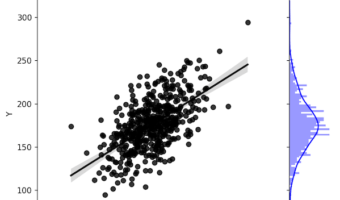
Sometimes when you make a scatter plot between two variables, it is also useful to have the distributions of each of the variables on the side as histograms. Scatter plots with marginal histograms on the side is a great way to do that. We can use Seaborn jointplot() function in … [Read more...] about Scatter Plot with Marginal Histograms in Python with Seaborn

Filed Under: Python, Seaborn jointplot Tagged With: Python, Seaborn

Bar Plots with Matplotlib in Python

datavizpyr · February 10, 2020 ·

How to Make Bar Plot in Ascending with Matplotlib?

In this post, we will see how to make bar plots with Matplotlib in Python. We will first start with making simple bar plot in matplotlib and then see how to make bar plots ordered in ascending and descending order. Let us load Pandas and matplotlib to make bar charts in … [Read more...] about Bar Plots with Matplotlib in Python

Filed Under: bar plot Matplotlib, Matplotlib, Python Tagged With: barplot, Matplotlib, Python

  • « Go to Previous Page
  • Page 1
  • Interim pages omitted …
  • Page 11
  • Page 12
  • Page 13
  • Page 14
  • Page 15
  • Interim pages omitted …
  • Page 19
  • Go to Next Page »

Primary Sidebar

Tags

Altair barplot Boxplot boxplot python boxplot with jiitered text labels Bubble Plot Color Palette Countplot Density Plot Facet Plot gganimate ggplot2 ggplot2 Boxplot ggplot2 error ggplot boxplot ggridges ggtext element_markdown() Grouped Barplot R heatmap heatmaps Histogram Histograms Horizontal boxplot Python lollipop plot Maps Matplotlib Pandas patchwork pheatmap Pyhon Python R RColorBrewer reorder boxplot ggplot Ridgeline plot Scatter Plot Scatter Plot Altair Seaborn Seaborn Boxplot Stock Price Over Time Stripplot UpSetR Violinplot Violin Plot World Map ggplot2

Buy Me a Coffee

Copyright © 2025 · Daily Dish Pro on Genesis Framework · WordPress · Log in

Go to mobile version