• Skip to primary navigation
  • Skip to main content
  • Skip to primary sidebar

Data Viz with Python and R

Learn to Make Plots in Python and R

  • Home
  • Seaborn
  • Matplotlib
  • ggplot2
  • Altair
  • About
    • Privacy Policy
  • Visualizing Activation Functions in Neural Networks
  • Confusion Matrix Calculator
  • Visualizing Dropout Rate in Neural Network
  • Visualizing Loss Functions in Neural Networks
  • Show Search
Hide Search

connect paired points Matplotlib

Connect Paired Data Points in a Scatter Plot in Python (Step-by-Step Guide)

datavizpyr · May 14, 2021 ·

Connect paired data points in a scatter plot with arrowheads and labels

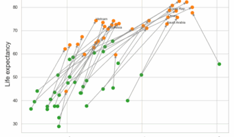
Want to connect paired data points in a scatter plot using Matplotlib? This step-by-step tutorial shows you how to draw lines between paired observations so you can easily visualize before–after comparisons, longitudinal changes, and repeated-measures data. We cover four … [Read more...] about Connect Paired Data Points in a Scatter Plot in Python (Step-by-Step Guide)

Filed Under: connect paired points Matplotlib, Matplotlib, Python Tagged With: Matplotlib, Python

Primary Sidebar

Python & R Viz Hubs

  • Seaborn Guide & Cookbook
  • ggplot2 Guide & Cookbook
  • Matplotlib Guide & Cookbook
  • Confusion Matrix Calculator
  • Visualizing Activation Functions
  • Visualizing Dropout
  • Visualizing Loss Functions

Buy Me a Coffee

Copyright © 2026 · Daily Dish Pro on Genesis Framework · WordPress · Log in

Go to mobile version