• Skip to primary navigation
  • Skip to main content
  • Skip to primary sidebar

Data Viz with Python and R

Learn to Make Plots in Python and R

  • Home
  • Python Viz
  • Seaborn
  • Altair
  • R Viz
  • ggplot2
  • About
    • Privacy Policy
  • Show Search
Hide Search

highlight a bar in barplot

How To Highlight a Bar in Bar Chart in Altair?

datavizpyr · March 18, 2020 ·

Highlight a bar in barplot in Altair

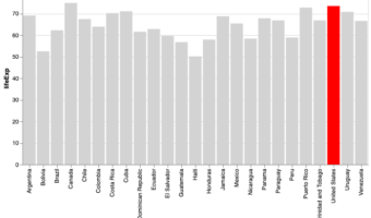
Bar charts are a simple visualization that plots a quantitative variable corresponding to categorical variable as bars. Sometimes we might want to highlight a specific bar in barplot with different color compared to the rest. In this post, we will see examples of * How to Make a … [Read more...] about How To Highlight a Bar in Bar Chart in Altair?

Filed Under: Altair, highlight a bar in barplot, Python Tagged With: Altair, barplot, Python

Primary Sidebar

Tags

Altair barplot Boxplot boxplot python boxplot with jiitered text labels Bubble Plot Color Palette Countplot Density Plot Facet Plot gganimate ggplot2 ggplot2 Boxplot ggplot2 error ggplot boxplot ggridges ggtext element_markdown() Grouped Barplot R heatmap heatmaps Histogram Histograms Horizontal boxplot Python lollipop plot Maps Matplotlib Pandas patchwork pheatmap Pyhon Python R RColorBrewer reorder boxplot ggplot Ridgeline plot Scatter Plot Scatter Plot Altair Seaborn Seaborn Boxplot Stock Price Over Time Stripplot UpSetR Violinplot Violin Plot World Map ggplot2

Buy Me a Coffee

Copyright © 2025 · Daily Dish Pro on Genesis Framework · WordPress · Log in

Go to mobile version