Last updated on October 28, 2025
Why Sorting and Customizing Bar Plots Matters? Most bar charts need two upgrades to be useful: (1) put the categories in a meaningful order (ascending/descending), and (2) add polish (value labels, colors, readable axes, or horizontal layout for long names). This tutorial shows how to do all of that—starting with sorting—and then layering on practical enhancements that make your plots publication-ready.
What you’ll learn: Sort a DataFrame and pass it to ax.bar(), print values with bar_label (Matplotlib ≥ 3.4), format the axis as currency/thousands, customize colors (including max/min highlights), and flip to barh when labels are long.
Quick Steps (Sorting-first workflow)
-
Prepare data:
df = pd.DataFrame({...}). -
Sort (recommended):
df = df.sort_values('Salary', ascending=True)(orFalsefor descending). -
Plot:
fig, ax = plt.subplots(); bars = ax.bar(df["Education"], df["Salary"]). -
Labels:
ax.bar_label(bars, fmt='${:,.0f}', padding=3)(Matplotlib ≥ 3.4). -
Axis formatting:
ax.yaxis.set_major_formatter(StrMethodFormatter('${x:,.0f}')). -
Horizontal (optional): use
ax.barh(...)when category names are long. -
Tidy:
plt.xticks(rotation=15, ha='right'); plt.tight_layout().
We will first start with making simple bar plot in matplotlib and then see how to make bar plots ordered in ascending and descending order.
Let us load Pandas and matplotlib to make bar charts in Python.
import matplotlib.pyplot as plt
import pandas as pd
Let us create some data for making bar plots. We will use the Stack Overflow Survey data to get approximate average salary and education information. We have the salary and educational qualification as two lists.
education = ["Bachelor's", "Less than Bachelor's","Master's","PhD","Professional"]
# mean annual salary in US dollars
salary = [110000,105000,126000,144200,95967]
Let us store the data as Pandas dataframe using pd.DataFrame function by providing the lists as dictionary.
# create Pandas dataframe from two lists
df = pd.DataFrame({"Education":education,
                  "Salary":salary})
It is a small dataframe with 5 rows and 2 columns.
df

       Education	Salary
0	Bachelor's	110000
1	Less than Bachelor's	105000
2	Master's	126000
3	PhD	144200
4	Professional	95967
This small dataset mimics real-world survey results showing average salaries by education level. It’s compact — only five rows — making it ideal for illustrating sorting and formatting techniques in bar charts.
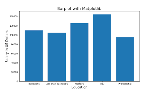
1) Simple Bar Plot (unsorted baseline)
Let us make a simple bar plot using matplotlib.pyplot in Python. In matplotlib, we can make barplot with bar() function. In this example, we specify Education on x-axis and salary on y-axis from our dataframe to bar() function.
plt.figure(figsize=(10,6))
# make bar plot with matplotlib
plt.bar('Education', 'Salary',data=df)
plt.xlabel("Education", size=15)
plt.ylabel("Salary in US Dollars", size=15)
plt.title("Barplot with Matplotlib", size=18)
plt.savefig("bar_plot_matplotlib_Python.png")
This simple bar plot uses ax.bar() to display salaries for each education group in the order they appear in the DataFrame. It’s the foundation for everything else in this tutorial. While the unsorted view shows all categories, it can be harder to interpret quickly. Still, it’s a useful starting point — we’ll enhance it step by step to make it clearer, more colorful, and better formatted. You’ll see how sorting, labeling, and formatting dramatically improve readability.
We have customized the barplot with x and y-axis labels and title for the bar plot. By default, matplotlib.pyplot chooses blue color to fill the bars of barplot.
3) Sort Bars in Ascending Order
How To Make Bar Plot in Ascending Order with Matplotlib?
Note that in the simple bar plot we made, bars are in the same order as it was in our dataframe. Sometimes it is better to order the bars of barplot in Ascending or Descending order.
Let us first see how to make bar plots ordered in ascending order with Matplotlib. To order the bars in ascending order, we first need to sort our dataframe in ascending order. We can use Pandas’ sort_values() function to order by Salary variable.
df_sorted= df.sort_values('Salary')
Pandas sort_values() function orders the dataframe in ascending order by default.
df_sorted

       Education	Salary
4	Professional	95967
1	Less than Bachelor's	105000
0	Bachelor's	110000
2	Master's	126000
3	PhD	144200
Now we can use the sorted dataframe with our bar() function to make barplot ordered in ascending order.
plt.figure(figsize=(10,6))
# bar plot with matplotlib
plt.bar('Education', 'Salary',data=df_sorted)
plt.xlabel("Education", size=15)
plt.ylabel("Salary in US Dollars", size=15)
plt.title("Bar plot in Ascending Order with Matplotlib", size=18)
plt.savefig("bar_plot_matplotlib_ascending_order_Python.png")
Sorting bars in ascending order makes patterns stand out instantly. The lowest salary now appears first, allowing readers to see growth from left to right. The sort_values() function rearranges the DataFrame by salary before plotting, so bars are automatically ordered.
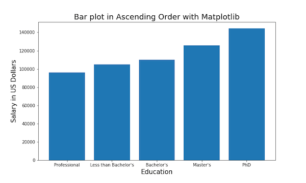
This view is helpful when showing gradual increases, such as education vs. income or time vs. sales. You’ll find this ordering style intuitive and visually clean — ideal for reports where you want to emphasize progression.
3) Sort Bars in Descending Order
To create barplot with bars ordered in descending order, we first sort the dataframe such that it is ordered in descending order. To sort the Pandas dataframe, we need to use ascending=False argument with Pandas sort_values() function.
df_sorted_desc= df.sort_values('Salary',ascending=False)
We get dataframe ordered in descending order. And we can use the sorted dataframe to make barplot in descending order.
plt.figure(figsize=(10,6))
# bar plot with matplotlib
plt.bar('Education', 'Salary',data=df_sorted_desc)
plt.xlabel("Education", size=15)
plt.ylabel("Salary in US Dollars", size=15)
plt.title("Bar plot in Descending Order with Matplotlib", size=18)
plt.savefig("bar_plot_matplotlib_descending_order_Python.png")
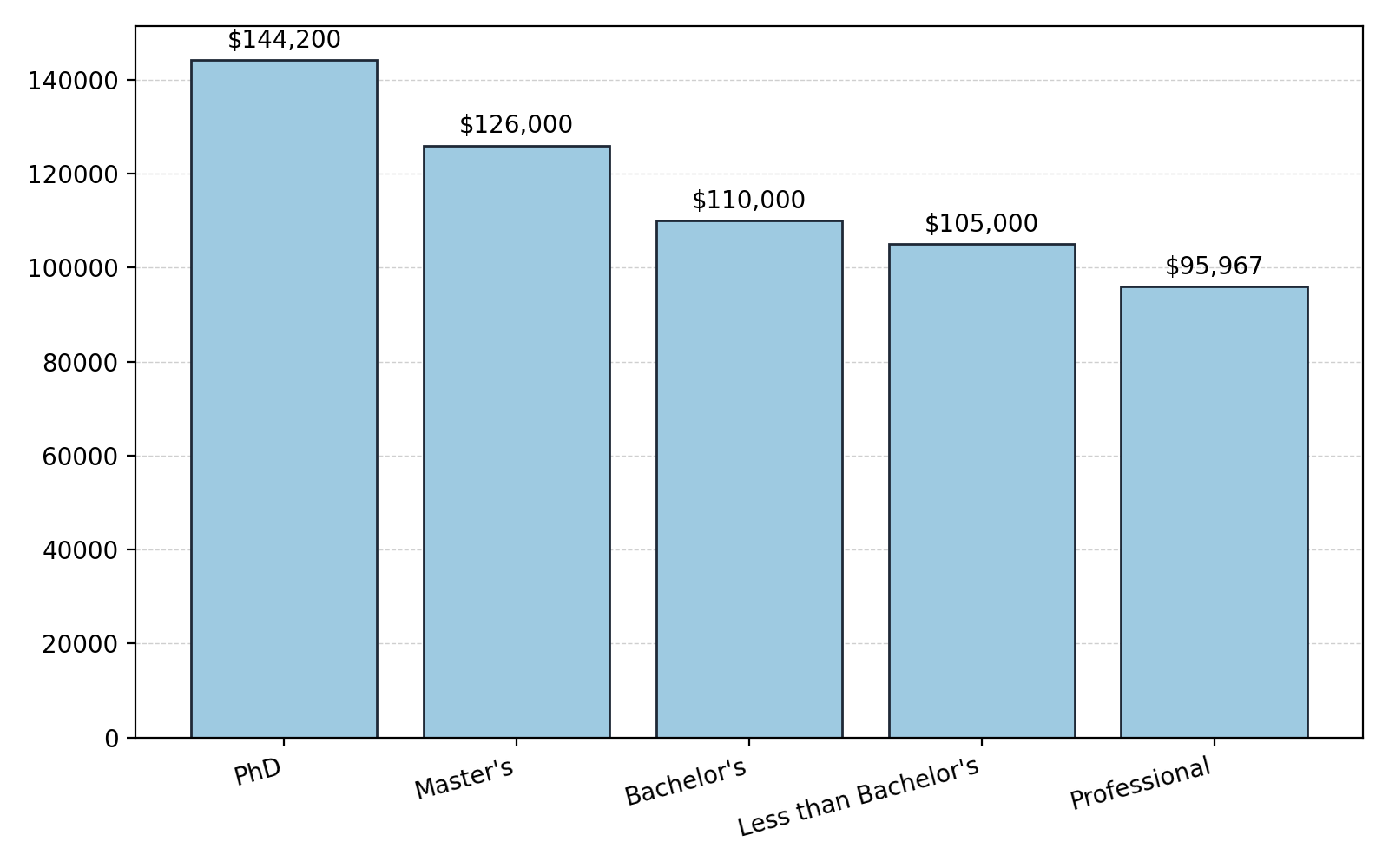
Descending order highlights the largest values first — useful for dashboards, summaries, or ranking tasks. The ascending=False flag flips the order so the highest bar appears on the left. This instantly draws attention to top categories, such as the highest salary group or best-performing product.
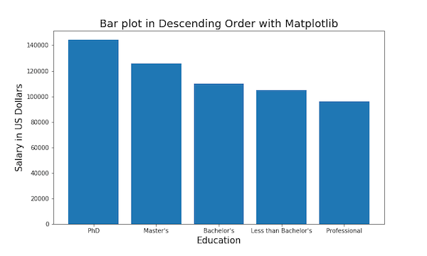
Even though it’s a simple tweak, it dramatically changes how viewers scan your chart. Combined with color and labeling (next steps), descending charts often make the best presentation visuals.
4) Add Value Labels on Bars
Adding data labels directly on bars makes values immediately visible, eliminating the need to cross-check axes. Matplotlib’s bar_label() (available since version 3.4) makes this effortless.
Here, we also use Python’s string formatting to display dollar values cleanly. The padding argument adds spacing between the top of each bar and its label, keeping the chart easy to read.
fig, ax = plt.subplots(figsize=(8,5))
bars = ax.bar(df_desc["Education"],
              df_desc["Salary"])  # sorted data for readability
ax.bar_label(bars, fmt='${:,.0f}',
             padding=3)
ax.set_title("Bar Plot with Value Labels (Descending & Labeled)")
plt.xticks(rotation=15, ha="right");
plt.tight_layout()
plt.savefig("bar-plot-matplotlib-add-labels.png", dpi=150)

Always combine sorting with labeling — it helps your audience compare categories without guessing exact values.
5) Customize Bar Colors
Color is one of the easiest ways to make a bar chart visually engaging. You can pass a list of hex color codes to the color parameter to assign each bar a unique shade. Here we use a blue palette from light to dark, helping the viewer distinguish categories while maintaining a cohesive look.
5.1 Individual Colors
colors = ["#6BAED6", "#9ECAE1", "#C6DBEF", "#DEEBF7", "#08519C"]
fig, ax = plt.subplots(figsize=(8,5))
bars = ax.bar(df_desc["Education"],
              df_desc["Salary"],
              color=colors)
ax.bar_label(bars, fmt='${:,.0f}',
             padding=3)
ax.set_title("Bar Plot with Custom Colors (Descending)")
plt.xticks(rotation=15, ha="right");
plt.tight_layout()
plt.savefig("bar-plot-matplotlib-add-colors.png", dpi=150)
Colors also add hierarchy — subtle tones for lower values, darker tones for higher ones. Always keep your palette consistent and accessible.
5.2 Highlight Max and Min Bars
vals = df_desc["Salary"]  # use the same order as plotted
rule_colors = [
    "#10B981" if v == vals.max() else ("#EF4444" if v == vals.min() else "#9CA3AF")
    for v in vals
]

fig, ax = plt.subplots(figsize=(8,5))
bars = ax.bar(df_desc["Education"],
              df_desc["Salary"],
              color=rule_colors)
ax.bar_label(bars, fmt='${:,.0f}',
             padding=3)
ax.set_title("Highlight Max (green) and Min (red) in Sorted Chart")
plt.xticks(rotation=15, ha="right");
plt.tight_layout()
plt.savefig("bar-plot-matplotlib-highlight-select-bars.png", dpi=150)
Rule-based coloring lets you automatically highlight important values. In this example, the highest salary bar is green and the lowest is red, while all others are gray. Conditional color rules like this make your chart self-explanatory: viewers instantly know which group earns the most or least

You can extend this idea by coloring bars above or below an average, or using thresholds for performance categories. It’s a small code change with big communication value.
6) Format Axis as Currency or Thousands
Formatting numbers as currency or with thousands suffixes improves professionalism and reduces mental effort. The StrMethodFormatter applies dollar formatting to axis tick labels using Python’s string syntax. This makes your chart publication-ready without manual editing.
from matplotlib.ticker import StrMethodFormatter, FuncFormatter

# Currency axis + labels on a sorted chart
fig, ax = plt.subplots(figsize=(8,5))
bars = ax.bar(df_asc["Education"],
              df_asc["Salary"])  # ascending for low→high feel
ax.yaxis.set_major_formatter(StrMethodFormatter('${x:,.0f}'))
ax.bar_label(bars,
             fmt='${:,.0f}',
             padding=3)
ax.set_title("Currency Axis + Value Labels (Ascending)")
plt.xticks(rotation=15, ha="right");
plt.tight_layout()
plt.savefig("bar-plot-matplotlib-currency-axis.png", dpi=150)

You can easily swap $ for other symbols (€, ₹, etc.). When combined with sorted bars and labels, a formatted axis gives readers a precise sense of scale and makes the data story instantly understandable.
7) Horizontal Bar Plot (great with sorted categories)
Horizontal bar charts are perfect when your category labels are long. They prevent text overlap and make ranking order clearer, especially when sorted. Here, the highest-earning group appears at the top — a natural direction for reading ranked lists. The same formatting and labeling techniques apply, just rotated 90 degrees.
from matplotlib.ticker import StrMethodFormatter

# Descending by salary so the top category appears at the top
df_desc = df.sort_values("Salary",
                         ascending=False)

fig, ax = plt.subplots(figsize=(8,5))
bars = ax.barh(df_desc["Education"],
               df_desc["Salary"],
               color="#6BAED6")
ax.xaxis.set_major_formatter(StrMethodFormatter('${x:,.0f}'))
ax.bar_label(bars, labels=[f'${v:,.0f}' for v in df_desc["Salary"]],
             padding=3)
ax.set_title("Horizontal Bar Plot (Sorted & Labeled)")
plt.tight_layout()
plt.savefig("horizontal-barplot-matplotlib.png", dpi=150)

In data reporting or survey results, horizontal charts often outperform vertical ones for clarity, especially when you have many categories or long names.
8) Polish the Chart
The final polish adds finishing touches that separate good charts from great ones. A light dashed grid improves readability, while edgecolor outlines each bar for definition. The tight_layout() ensures nothing gets clipped in exports, and saving at a higher DPI creates crisp images suitable for presentations or publications.
fig, ax = plt.subplots(figsize=(8,5))
bars = ax.bar(df_desc["Education"],
              df_desc["Salary"],
              color="#9ECAE1",
              edgecolor="#1F2937")
ax.yaxis.grid(True, linestyle="--",
              linewidth=0.5,
              alpha=0.6)
ax.set_axisbelow(True)  # grid behind bars
ax.bar_label(bars,
             fmt='${:,.0f}',
             padding=3)
plt.xticks(rotation=15, ha="right")
plt.tight_layout()
plt.savefig("bar-plot-matplotlib-polished.png", dpi=200)
Together, these tweaks enhance both aesthetic and interpretability — a professional finish to your Matplotlib bar plots.
Common Errors & Quick Fixes
-
Labels missing: Use
bars = ax.bar(...)thenax.bar_label(bars)(Matplotlib ≥ 3.4). - Misaligned colors after sorting: Build colors from the same sorted DataFrame used for plotting.
-
Overlapping text: Rotate x-labels and call
plt.tight_layout(). - Formatter not applied: Always set axis formatters after creating the plot.
FAQs
How do I sort a Matplotlib bar chart by value?
Sort the DataFrame before plotting: df = df.sort_values('Salary', ascending=True) (or False), then pass the sorted frame to ax.bar() or ax.barh(). Building colors/labels from the same sorted frame keeps everything aligned.
Should I use ascending or descending order?
Ascending is great for showing growth/accumulation (low→high). Descending highlights top categories first (dashboard style). For horizontal bars, descending puts the largest bar at the top—easier to scan.
How do I add value labels to bars in Matplotlib?
Use bar_label (Matplotlib ≥ 3.4). Example: bars = ax.bar(...); ax.bar_label(bars, fmt='${:,.0f}', padding=3).
How do I change bar colors?
Pass a single color for all bars or a list of hex colors (per-bar). For rule-based coloring (e.g., highlight max/min), compute a color list from the sorted values and pass it to color.
How can I format the y-axis as currency?
Use StrMethodFormatter: from matplotlib.ticker import StrMethodFormatter then ax.yaxis.set_major_formatter(StrMethodFormatter('${x:,.0f}')).