
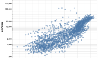
In this post we will learn how to color scatter plots using another variable in the dataset in R with ggplot2. Scatter plots are extremely useful identify any trend between two quantitative variables. However, often you have additional variable in a data set and you might be … [Read more...] about How To Color Scatter Plot by Variable in R with ggplot2?
How To Color Boxplots By a Variable in R with ggplot2?

In this tutorial, we learn how to color boxplots in R by a variable. With ggplot2 in R, we can color boxplots in multiple ways. In this post, we will first see how to make a simple boxplot in R. And then we will learn how to fill the boxes on boxplot by a variable. Then we will … [Read more...] about How To Color Boxplots By a Variable in R with ggplot2?
How To Make Bubble plot with Altair in Python?
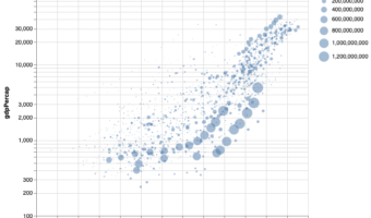
Bubble plot is a data visualization technique that shows bubbles i.e. circles on a two dimensional plot. Bubble plot is simply a scatter plot where we plot bubbles/circles instead of points in a scatter plot. Bubble chart is useful when you have three variables and the size of … [Read more...] about How To Make Bubble plot with Altair in Python?
Introduction to Color Palettes in R with RColorBrewer
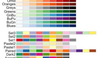
Choosing colors for data visualization in R is hard—especially if you want charts that are clear, consistent, and inclusive. The RColorBrewer package (based on a href="http://colorbrewer2.org/">ColorBrewer2) gives you carefully designed sequential, diverging, and qualitative … [Read more...] about Introduction to Color Palettes in R with RColorBrewer
How To Color a Scatter Plot by a Variable in Altair?
In this tutorial, we will learn how to color data points in a scatter plot by a variable using Altair in Python. Let us load Altair and Pandas. We will use gapminder data to make scatter plot first and color by a variable using Altair. To make a simple scatter … [Read more...] about How To Color a Scatter Plot by a Variable in Altair?