Last updated on April 25, 2020
One of the annoying things while making a plot is fine tuning it the way you want. Sometimes ones of such pain points is placing the title on the plot. Till recently, ggplot2 placed title or subtitle such that it aligns with the plotting area. In this post we will learn how to use ggplot2 version 3.3.0 (and above) to adjust the title/subtile of a plot such that it aligns with whole plot not just the plotting area.
Let us load tidyverse and make sure we have the right ggplot2 version with packageVersion() function.
library(tidyverse)
theme_set(theme_bw(base_size = 16))
packageVersion("ggplot2")
'3.3.0'
To illustrate this, let us make a boxplot using fast food data from TidyTuesday project. We will directly load the data from TidyTuesday’s github page.
fast_food <- readr::read_csv("https://raw.githubusercontent.com/rfordatascience/tidytuesday/master/data/2018/2018-09-04/fastfood_calories.csv")
Let us subset the data and select just tow columns we will be plotting. Here we also change the factor levels.
fast_food <- fast_food %>%
  mutate(restaurant=fct_reorder(restaurant, cholesterol)) %>%
  select(restaurant,cholesterol)
Our data looks like this.
fast_food %>% head()


restaurant cholesterol
<fctr>.      <dbl>
Mcdonalds	95
Mcdonalds	130
Mcdonalds	220
Mcdonalds	155
Mcdonalds	120
Mcdonalds	80
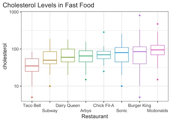
Let us make simple boxplot with a title. To add a title here we use labs() function and title argument inside.
fast_food %>%
  ggplot(aes(x=restaurant, y=cholesterol, color=restaurant)) +
  geom_boxplot()+
  scale_y_log10()+
  labs(x="Restaurant",title="Cholesterol Levels in Fast Food") +
  scale_x_discrete(guide = guide_axis(n.dodge=2))+
  theme(legend.position="none")
ggsave("default_title_position_in_gplot2.jpg")
We get a nice boxplot as wanted. Notice how the title is placed on the plot by default. One can see that it is aligned with plotting area, i.e. here the box around the boxplots.
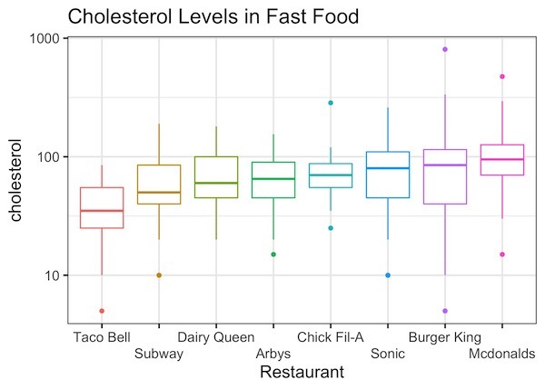
Starting from ggplot2 version 3.3.0, we can adjust the position of title and subtitle usingg “plot.title.position” argument inside theme() function.
In this example, we adjust the title position using “theme(plot.title.position = “plot”)”
fast_food %>%
  ggplot(aes(x=restaurant, y=cholesterol, color=restaurant)) +
  geom_boxplot()+
  scale_y_log10()+
  labs(x="Restaurant",title="Cholesterol Levels in Fast Food") +
  scale_x_discrete(guide = guide_axis(n.dodge=2))+
  theme(legend.position="none")+
  theme(plot.title.position = "plot")
ggsave("adjust_title_position_to_align_with_plot_in_gplot2_v3.3.0.jpg")
Check the starting point of the title from this plot and compare it with the default plot above. And we get a plot with title that aligns with the whole plot. This can be useful when the title is long or one prefers to have the title this way.