Last updated on January 15, 2020
Adding a vertical line on mean or median value of a distribution to its density plot can make understanding the plot easier. In this post, we will first see a simple example of adding mean line to a density plot using ggplot2 in R. And then we will also see an example of adding a text summary/annotation for the mean line on the density plot.
Let us load tidyverse and set black and white ggplot theme with base size for labels.
library(tidyverse)
theme_set(theme_bw(base_size=16))
Here we will use the processed data from 2019 Stack Overflow Developer Survey results to make the density plot of developer salaries in US.
salary_data_file <- "https://raw.githubusercontent.com/datavizpyr/data/master/SO_data_2019/2019_Stack_Overflow_Survey_Education_Salary_US.tsv"
# load Stack Overflow US salary data
salary_data <- read_tsv(salary_data_file)
Our dataframe contains just two columns; salary and education info.
salary_data %>% head()

## # A tibble: 6 x 2
##   CompTotal Education
##       <dbl> <chr>
## 1    180000 Master's
## 2     55000 Bachelor's
## 3     77000 Bachelor's
## 4     67017 Bachelor's
## 5     90000 Less than bachelor's
## 6     58000 Bachelor's
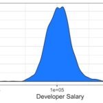
Let us make a density plot of the developer salary using ggplot2 in R. ggplot2’s geom_density() function will make density plot of the variable specified in aes() function inside ggplot().
To make the density plot look slightly better, we have filled with color using fill and alpha arguments. In addition, we have changed the scale of x-axis to log-scale using scale_x_log10()
salary_data %>%
  ggplot(aes(x=CompTotal)) +
  geom_density( fill="dodgerblue", alpha=0.5)+
  scale_x_log10()
And this is how the density plot with log scale on x-axis looks like. log-scale on x-axis help squish the outlier salaries.

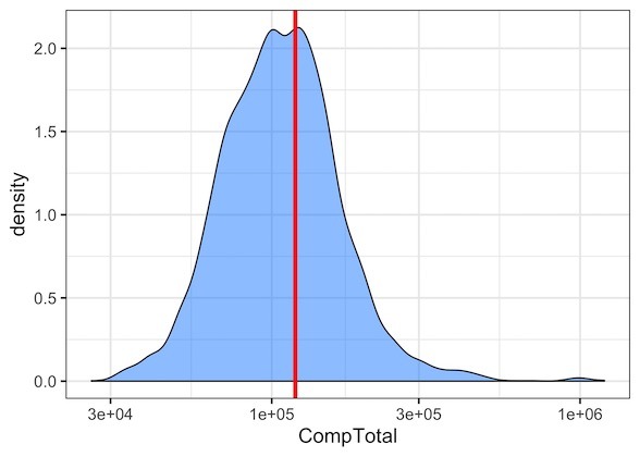
Now that we have a density plot made with ggplot2, let us add vertical line at the mean value of the salary on the density plot.
With ggplot2, we can add a vertical line using geom_vline() function. We need to specify xintercept argument to geom_vline() function. In our example, we need to prove the mean value of salary to xintercept argument.
Let us compute mean value of salary first and assign it to a variable.
# compute mean salary
mean_salary <- salary_data %>%
  pull(CompTotal) %>%
  mean() %>%
  signif(6)
Once we have computed mean value, we know exactly where to add the vertical line on the density plot. Now we are ready to add vertical line to the density plot.
To add vertical line, we add geom_vline() function with mean salary value as xintercept. In addition, we also specify the thickness of the line with size argument and color of the line with color argument.
# add vertical mean line to density plot with geom_vline()
salary_data %>%
  ggplot(aes(x=CompTotal)) +
  geom_density( fill="dodgerblue", alpha=0.5)+
  scale_x_log10()+
  geom_vline(xintercept=mean_salary, size=1.5, color="red")
Let us improve the density plot with mean line by adding text annotation. In ggplot2, we can add text annotation to a plot using geom_text() function.
geom_text() function takes x and y coordinates specifying the location on the plot wehere we want to add text and the actual text as input.
In our example, we specify the x coordinate to be around the mean line on the density plot and y value to be near the top of the plot. And we provide the mean value as the text for our annotation.
salary_data %>%
  ggplot(aes(x=CompTotal)) +
  geom_density( fill="dodgerblue", alpha=0.5)+
  scale_x_log10()+
  labs(x="Salary in US Dollars")+
  geom_vline(xintercept=mean_salary, size=1.5, color="red")+
  geom_text(aes(x=mean_salary+60000, label=paste0("Mean\n",mean_salary), y=1.9))