Last updated on August 22, 2025
Sometimes when you make a scatter plot between two variables, it is also useful to have the distributions of each of the variables on the side as histograms. Scatter plots with marginal histograms on the side is a great way to do that. We can use Seaborn jointplot() function in Python to make Scatter plot with marginals in Python.
Let us load the packages needed.
👉 Want more? Explore the full Seaborn Tutorial Hub with 35+ examples, code recipes, and best practices.
import numpy as np
import matplotlib.pyplot as plt
import pandas as pd
import seaborn as sns
We will simulate two variables for making scatter plot using NumPy’s random module.
np.random.seed(42)
N = 500
x = np.random.normal(170, 20, N)
y= x + np.random.normal(5, 25, N)
colors = np.random.choice(3, N)
Let us store the data as a Pandas dataframe.
df = pd.DataFrame({
    'X': x,
    'Y': y,
    'Colors': colors})
df.head(n=3)

X	Y	Colors
0	179.934283	208.088722	2
1	167.234714	219.970130	0
2	182.953771	152.989581	2
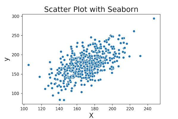
Now we are ready to make scatter plot with marginal histograms. Let us start with making a simple scatter plot first using Seaborn’s scatterplot() function.
sns.scatterplot(x="X", y="Y", data=df)
plt.xlabel("X", size=16)
plt.ylabel("y", size=16)
plt.title("Scatter Plot with Seaborn", size=18)
plt.savefig("simple_scatter_plot_Seanborn.png",figsize=(4,4), dpi=150)
We can see the clear relation between two variables.
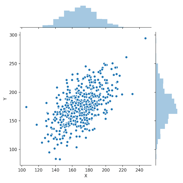
Marginal Plot in Python with Seaborn jointplot()
Sometimes when you make scatterplot with a lot of data points, overplotting can be an issue. Overlapping data points can make it difficult to fully interpret the data. Having marginal histograms on the side along with the scatter plot can help with overplotting.
To make the simplest marginal plot, we provide x and y variable to Seaborn’s jointplot() function.
sns.jointplot(x="X",
              y="Y",
             edgecolor="white",
             data=df);
#plt.title("Scatter Plot with Marginal Histograms: Seaborn", size=18, pad=80)
plt.savefig("marginal_plot_Seaborn.png",figsize=(4,4), dpi=150)
In this marginal plot example, we have also specified the edgecolor for the data points in scatter plot.
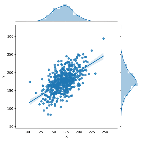
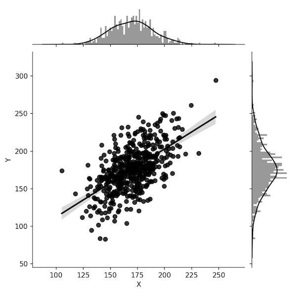
How to Add Regression Line to Marginal Plot with Seaborn jointplot()?
We can customize the scatter plot with marginal histogram further. Let us add a regression line to the scatter plot to help easily see the trend between the variables. With jointplot(), we can add regression line using the argument kind=”reg”.
sns.jointplot(x="X",
              y="Y",
              kind="reg",
              data=df)
plt.savefig("marginal_plot_with_regression_line_Seaborn.png",figsize=(4,4), dpi=150)
Now we have scatter plot with a regression line and marginal histograms
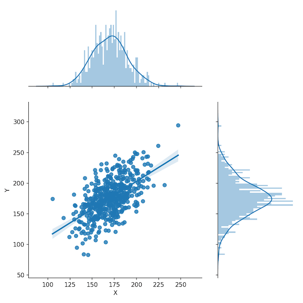
How to Change Number of Bins to Marginal Plot with Seaborn jointplot()?
sns.jointplot(x="X",
              y="Y",
              data=df,
              kind="reg",
              color="k",
              marginal_kws=dict(bins=100))
plt.savefig("marginal_plot_changing_histogram_bins_Seaborn.png",figsize=(4,4), dpi=150)
How to Change Color of Marginal Histogram Plot with Seaborn jointplot()?
sns.jointplot(x="X",
              y="Y",
              data=df,
              kind="reg",
              color="k",
              marginal_kws=dict(bins=100,color='b'))
plt.savefig("marginal_plot_different_color_histogram_Seaborn.png",figsize=(4,4), dpi=150)

How to Make Marginal Plot with focus on Histogram in Seaborn jointplot()?
sns.jointplot(x="X",
              y="Y",
              data=df,
              kind="reg",
              height=7,
              ratio=2,
              marginal_kws=dict(bins=100))
plt.savefig("marginal_plot_with_focus_on_marginals_Seaborn.png",figsize=(4,4), dpi=150)