Last updated on January 18, 2020
Bubble plot is a data visualization technique that shows bubbles i.e. circles on a two dimensional plot. Bubble plot is simply a scatter plot where we plot bubbles/circles instead of points in a scatter plot. Bubble chart is useful when you have three variables and the size of the bubbles show the third variable.
In this tutorial, we will learn how to make bubble plot using Altair in Python.
Let us load Altair and Pandas.
import altair as alt
import pandas as pd
Let us use gapminder data to make bubble plot in Python with Altair.
data_url = 'http://bit.ly/2cLzoxH'
gapminder = pd.read_csv(data_url)
gapminder.head()

country	year	pop	continent	lifeExp	gdpPercap
0	Afghanistan	1952	8425333.0	Asia	28.801	779.445314
1	Afghanistan	1957	9240934.0	Asia	30.332	820.853030
2	Afghanistan	1962	10267083.0	Asia	31.997	853.100710
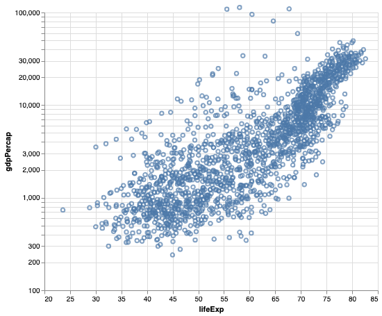
We will first make scatter plot in Altair using mark_point() function on chart object. Here, we make a scatter plot between lifeExp and gdpPercap from gapminder data. And we have the y-axis on log scale in the scatter plot.
alt.Chart(gapminder).mark_point().encode(
    alt.X('lifeExp', scale=alt.Scale(domain=(20, 85))),
    alt.Y('gdpPercap', scale=alt.Scale(type='log', base=10, domain=(100, 100000))),
).properties(height=400,width=480)
Bubble Plot with Altair in Python
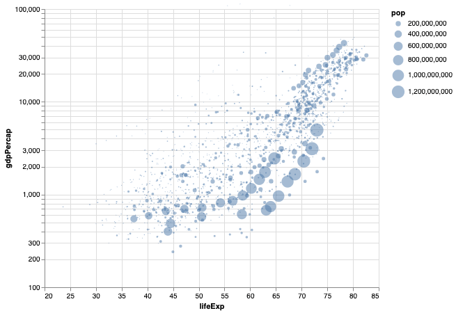
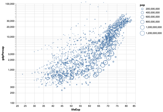
We can easily convert the simple scatter plot into a bubble plot in Altair by specifying the third variable with size argument inside encode() function . In this example, we use population as third variable and the bubble plot will show countries with larger population with bigger bubbles.
alt.Chart(gapminder).mark_point().encode(
    alt.X('lifeExp', scale=alt.Scale(domain=(20, 85))),
    alt.Y('gdpPercap', scale=alt.Scale(type='log', base=10,domain=(100, 80000))),
    size='pop'
).properties(height=400,width=480)
How To Make Bubble Plot with Filled Circles with Altair?
In the above bubble plot we made, the bubbles are open circles. We can customize the bubble plot further with filling the circles with the color. And we can also add transparency to the fill.
In Altair, we can fill the circle with filled=True inside mark_point() and add transparency using opacity=0.5.
alt.Chart(gapminder).mark_point(filled=True, opacity=0.5).encode(
    alt.X('lifeExp', scale=alt.Scale(domain=(20, 85))),
    alt.Y('gdpPercap', scale=alt.Scale(type='log', base=10,domain=(100, 80000))),
    size='pop'
).properties(height=400,width=480)
Now the bubbles on bubble chart are filled with transparency.