Last updated on August 29, 2025
How to Make a Heatmap in Python with Matplotlib (Step-by-Step Guide)
Heatmaps are a powerful way to visualize matrices and time-based data. They let you quickly spot trends, patterns, and seasonality in numbers. While libraries like Seaborn provide a high-level heatmap() function, Matplotlib’s imshow() gives you low-level control and flexibility to customize every part of your plot.
In this tutorial, we’ll create a heatmap using imshow() with real-world Flights data from Seaborn. We’ll start simple and progressively add labels, colorbars, and custom colormaps to make it publication-quality.
Step 1: Import Libraries
We’ll use Matplotlib, NumPy, Pandas, and Seaborn for dataset loading.
import numpy as np
import matplotlib.pyplot as plt
import pandas as pd
import seaborn as sns
Step 2: Load and Prepare the Flights Dataset
We will use flights dataset available in Seaborn’s built-in datasets. The flights dataset records monthly passengers between 1949 and 1960. We pivot the data so that months become rows and years become columns (matrix form).
flights = sns.load_dataset("flights")
# pivoting to make the data wide
flights = flights.pivot("month", "year", "passengers")
flights.head()


year	1949	1950	1951	1952	1953	1954	1955	1956	1957	1958	1959	1960
month
Jan	112	115	145	171	196	204	242	284	315	340	360	417
Feb	118	126	150	180	196	188	233	277	301	318	342	391
Mar	132	141	178	193	236	235	267	317	356	362	406	419
Apr	129	135	163	181	235	227	269	313	348	348	396	461
May	121	125	172	183	229	234	270	318	355	363	420	472
Step 3: Simple Heatmap with imshow()
Once in matrix form, we can display the data directly with imshow(). This creates a basic heatmap.
fig, ax = plt.subplots(figsize=(10,10))
im = ax.imshow(flights)
Let us add simple annotation first to make the heatmap slightly better. Here we have added a title to the heatmap using set_title() function.
fig, ax = plt.subplots(figsize=(8,6))
im = ax.imshow(flights)
ax.set_title("Matplotlib Heatmap with imshow", size=16)
fig.tight_layout()
plt.savefig("heatmap_in_matplotlib_using_imshow.png",
                    format='png',dpi=150)
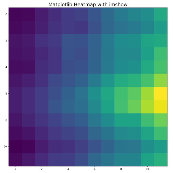
Note: At this stage, the axes don’t yet show month/year labels.
Note that x and y axis labels are missing.
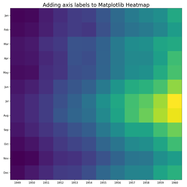
Step 4: Add Axis Labels
To add the axis labels let us get the months and years values from the row and column names of flights dataset. We add month names on the y-axis and years on the x-axis using set_xticks() and set_yticks().
months = flights.index.values
months
years = flights.columns.values
Now we can add the years on x -axis and months on y-axis tick labels. In Matplotlib, we can add the tick labels using set_xticks() and set_yticks() functions.
fig, ax = plt.subplots(figsize=(10,10))
im = ax.imshow(flights)
# Add axis tick labels
ax.set_xticks(np.arange(len(years)),
              labels=years)
ax.set_yticks(np.arange(len(months)),
              labels=months)
ax.set_title("Adding axis labels to Matplotlib Heatmap",
             size=20)
fig.tight_layout()
plt.savefig("axis_labels_in_heatmap_in_matplotlib.png",
                    format='png',dpi=150)
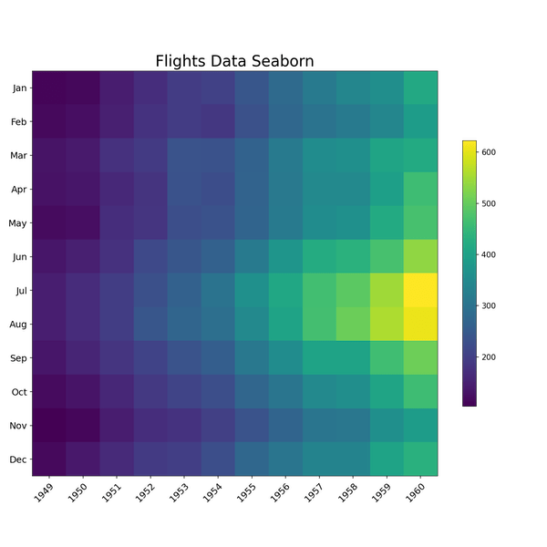
Step 5: Add a Colorbar
A colorbar makes the heatmap interpretable by linking colors to numeric values. We can add color bar legend to help understand the range of numerical values and their association with the colors to the heatmap using figure.colorbar() function. Sometimes the color bar added can be slightly bigger than the heatmap. Here we have use shrink argument to reduce the size of the color bar.
fig, ax = plt.subplots( figsize=(10,10))
im = ax.imshow(flights)
cbar = ax.figure.colorbar(im,
                          ax = ax,
                          shrink=0.5 )
# add tick labels
ax.set_xticks(np.arange(len(years)),
              labels=years,
              size=12)
ax.set_yticks(np.arange(len(months)),
              labels=months,size=12)
# Rotate the tick labels to be more legible
plt.setp(ax.get_xticklabels(),
         rotation = 45,
         ha = "right",
         rotation_mode = "anchor")
ax.set_title("Flights Data Seaborn", size=20)
fig.tight_layout()
plt.savefig("how_to_make_a_heatmap_with_matplotlib_Python.png",
                    format='png',dpi=150)
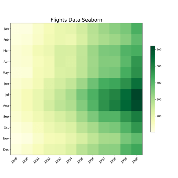
Step 6: Customize the Color Palette
By default, Matplotlib’s imshow() use viridis color palette to make the heatmap. You can change the colormap using the cmap argument. Here we use the YlGn palette for a green gradient.
fig, ax = plt.subplots( figsize=(10,10))
im = ax.imshow(flights, cmap="YlGn")
cbar = ax.figure.colorbar(im,
                          ax=ax,
                          shrink=0.5 )
# add tick labels
ax.set_xticks(np.arange(len(years)),
              labels=years,
              size=12)
ax.set_yticks(np.arange(len(months)),
              labels=months,
              size=12)
# Rotate the tick labels to be more legible
plt.setp(ax.get_xticklabels(),
         rotation=45,
         ha="right",
         rotation_mode="anchor")
ax.set_title("Flights Data Seaborn", size=20)
fig.tight_layout()
plt.savefig("change_heatmap_color_palette_matplotlib_Python.png",
                    format='png',dpi=150)
FAQs
-
How do I change the color palette of a heatmap in Matplotlib?
Use thecmapargument inimshow(), e.g.,cmap="coolwarm"orcmap="magma". You can also create custom colormaps withmatplotlib.colors. -
How can I add numeric values inside a heatmap?
Loop over the matrix withax.text()to annotate each cell. Example:
ax.text(j, i, flights.iloc[i, j], ha="center", va="center"). -
How do I control the color scale range in imshow?
Usevminandvmaxarguments inimshow(). For example,imshow(data, vmin=100, vmax=500)ensures consistent color scaling across multiple plots. -
How do I reverse the color scale in a heatmap?
Append_rto the colormap name (e.g.,cmap="viridis_r") to flip it. This is useful if you want high values in lighter colors instead of darker. -
How can I improve readability of tick labels in large heatmaps?
Rotate labels withplt.setp(ax.get_xticklabels(), rotation=45, ha="right"). For long labels, reduce font size usingfontsizeinset_xticks(). -
How do I export heatmaps as high-resolution images?
Useplt.savefig("heatmap.png", dpi=300, bbox_inches="tight")to get a publication-quality PNG or PDF. -
How do I normalize values across multiple heatmaps for comparison?
Specify a sharedvminandvmaxfor all heatmaps, so the same color scale is applied to each figure. -
How do I add a custom colorbar with specific ticks?
Create a colorbar and then set ticks withcbar.set_ticks([100, 200, 300])andcbar.set_ticklabels(["Low", "Medium", "High"]).