Last updated on August 22, 2025
Understanding the level of missing data in the data set analysis should be one of the first things we all should do while doing data analysis. In this post, we will use Python’s Seaborn library to quickly visualize how much data is missing in a data set.
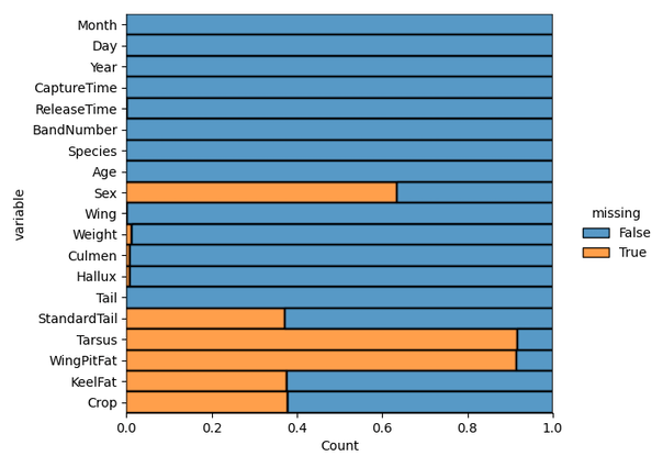
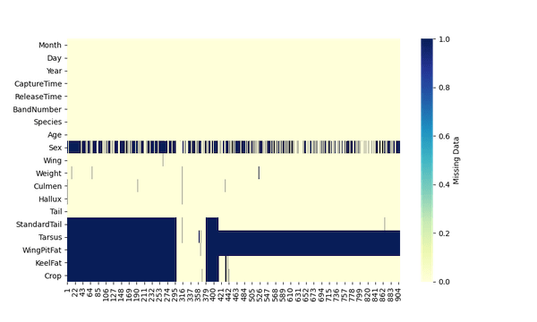
One of the ways to visualize the missing data is make a heatmap of the data coded as boolean for missing-ness. Second way is visualize the amount of missing data is to make a stacked bar plot showing how much of the data is missing for each variable in the dataset (h/t to Michael Waskom, the creator of Seaborn).
👉 Want more? Explore the full Seaborn Tutorial Hub with 35+ examples, code recipes, and best practices.
Let us use one of the datasets from this cool data resource, RDatasets
import pandas as pd
import seaborn as sns
import matplotlib.pyplot as plt
url = "https://vincentarelbundock.github.io/Rdatasets/csv/Stat2Data/Hawks.csv"
hawks = pd.read_csv(url, index_col=0)
The key function for both the approaches to visualize missing data is to use Pandas isna() function to find if each element in the dataframe is a missing value or not. By using isna() on Pandas dataframe, we get a boolean dataframe with True for missing data and False for the NOT missing data.
Visualizing Missing Data using Seaborn heatmap()
First, we will use Seaborn’s heatmap() to make a heatmap of the data to visualize the missing data in each variable. Here we use the transposed boolean dataframe from isna() as input Seaborn’s heatmap() function.
plt.figure(figsize=(10,6))
sns.heatmap(hawks.isna().transpose(),
            cmap="YlGnBu",
            cbar_kws={'label': 'Missing Data'})
plt.savefig("visualizing_missing_data_with_heatmap_Seaborn_Python.png", dpi=100)
Visualizing Missing Data using Seaborn displot()
Another way to visualise missing data is to compute the proportion of the missing data for each variable in the data and make stacked barplot. We can use Seaborn’s displot() function. Here we provide the data in long form using melt() to displot() function.
plt.figure(figsize=(10,6))
sns.displot(
    data=hawks.isna().melt(value_name="missing"),
    y="variable",
    hue="missing",
    multiple="fill",
    aspect=1.25
)
plt.savefig("visualizing_missing_data_with_barplot_Seaborn_distplot.png", dpi=100)