Last updated on August 22, 2025
In this tutorial, we will see how to join or combine two plots with shared y-axis. As an example, we will make a scatterplot and join with with marginal density plot of the y-axis variable matching the variable colors. Thanks to Seaborn’s creator Michael Waskom’s wonderful tip on how to do this.
👉 Want more? Explore the full Seaborn Tutorial Hub with 35+ examples, code recipes, and best practices.
Let us get started by loading the packages needed.
import seaborn as sns
import pandas as pd
import matplotlib.pyplot as plt
We will use Penguins dataset to make two plots and combine them. Palmer penguins dataset is available from Seaborn’s built-in datasets.
penguins = sns.load_dataset("penguins")
Specifying layouts for combined plots with Matplotlib’s subplots()
To start with, we will use Matplotlib’s subplots() function to specify the layout for our plot. Since we know that we will be making two plots with shared y-axis, we will specify subplots with one row and two columns with shared y-axis. We also specify figure size.
f, axs = plt.subplots(1,2,
                      figsize=(9,5),
                      sharey=True)
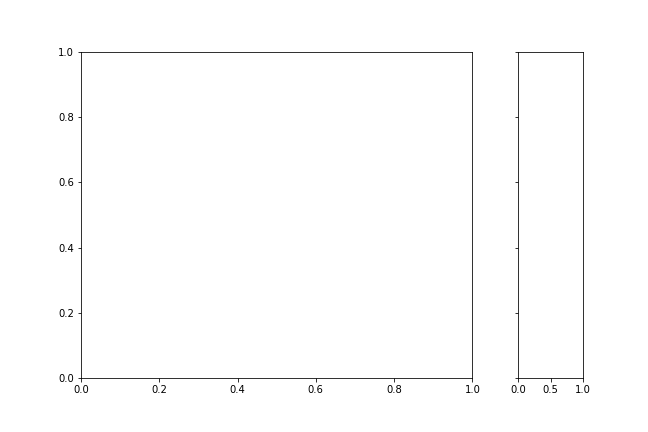
And our layout looks like this, with space for two plots of equal sizes in a row. We know that want to make marginal density plot, therefore, the widths of two plots need to be different.

Since our original goal was to make a marginal density plot along the y-axis, we need to adjust the plot sizes. With Matplotlib’s subplots, we can use gridspec_kw argument to specify the with ratios for the plots.
f, axs = plt.subplots(1,2,
                      figsize=(9,5),
                      sharey=True,
                     gridspec_kw=dict(width_ratios=[3,0.5]))
After adjusting the widths of the two plots, our layout looks like this for our scatterplot combined with density plot.
Now we are ready to make the two plots with Seaborn and combine them with shared y-axis. Let us first, make scatterplot with Seaborn scatterplot() function. One of the key arguments needed is to use the ax argument to specify the subplot location for the scatter plot. Here it is first subplot.
sns.scatterplot(data= penguins,
                x="flipper_length_mm",
                y="bill_length_mm",
                hue="species",
                ax=axs[0],
                )
Next, we make density plot, but this time we specify the second subplot location with “ax” argument.
sns.kdeplot(data= penguins,
                y="bill_length_mm",
                hue="species",
                ax=axs[1],
                legend=False)
f.tight_layout()
Note that we also make sure we don’t have legends two times. In this example, we have legends for scatter plot, but not for the density plot.
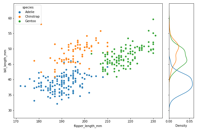
How To Combine Two Seaborn plots with shared y-axis?
And now we have successfully combined two Seaborn plots using Matplotlib’s subplots() function. Here is the complete code chunk to specify the subplots() and combine two plots made with Seaborn.
# specify plot layouts with different width using subplots()
f, axs = plt.subplots(1,2,
                      figsize=(9,6),
                      sharey=True,
                     gridspec_kw=dict(width_ratios=[3,0.5]))
# make scatterplot with legends
sns.scatterplot(data= penguins,
                x="flipper_length_mm",
                y="bill_length_mm",
                hue="species",
                ax=axs[0],
                )
# make densityplot with kdeplot without legends
sns.kdeplot(data= penguins,
                y="bill_length_mm",
                hue="species",
                ax=axs[1],
                legend=False)
f.tight_layout()
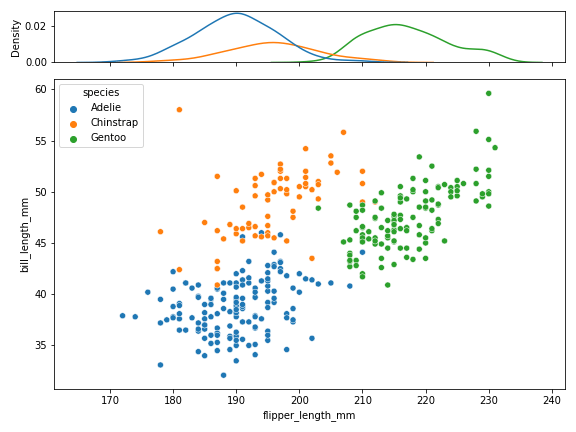
How To Combine Two Seaborn plots with shared x-axis?
Similarly, we can combine two plots made with Seaborn with shared x-axis. In this example, we will make scatter plot as before, but this time we will add marginal density plot with shared x-axis.
One of the first changes we need to make is to specify the subplot layout to be two rows and a single column with shared x-axis using Matplotlib’s subplots() function. And we also need to change the plots widths using gridspec_kw argument. Now we first make density plot at first row first column using ax argument and then make scatterplot at second row first column.
# specify plot layouts with different width using subplots()
f, axs = plt.subplots(2,1,
                      figsize=(8,6),
                      sharex=True,
                      gridspec_kw=dict(height_ratios=[0.5,3]))
# makde density plot along x-axis without legend
sns.kdeplot(data= penguins,
                x="flipper_length_mm",
                hue="species",
                ax=axs[0],
                legend=False)
# make scatterplot with legends
sns.scatterplot(data= penguins,
                x="flipper_length_mm", y="bill_length_mm",
                hue="species",
                ax=axs[1],
                )
f.tight_layout()
plt.savefig("seaborn_combine_two_plots_with_shared_x_axis_Python.png")