Last updated on August 22, 2025
Seaborn’s scatterplot function allows us to make compelling scatter plots easily. In this post we will learn how to customize edge color of a scatter plot made with Seaborn. By default, Seaborn’s scatter plot function colors the markers edge color to be white.
In this post, we will see how to change the default edge color. First, we will see how to remove the white edge color and then see how to color the edge with a specific color of interest. And then we will also see how to change the thickness of the edge color line. Finally, we will learn how to use kwargs (key word arguments) to pass multiple arguments to customize Seaborn plot.
👉 Want more? Explore the full Seaborn Tutorial Hub with 35+ examples, code recipes, and best practices.
import matplotlib.pyplot as plt
import numpy as np
import pandas as pd
import seaborn as sns
penguins_data="https://raw.githubusercontent.com/datavizpyr/data/master/palmer_penguin_species.tsv"
# load penguns data with Pandas read_csv
df = pd.read_csv(penguins_data, sep="\t")
df.head()
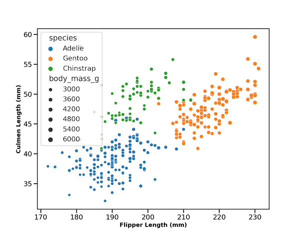
Seaborn’s scatterplot with default white edgecolor
Let us make a scatter plot with Seaborn’s scatterplot function. Here we color the points by a variable and also use another variable to change the size of the markers or points.
By default, Seaborn’s scatterplot colors the outer line or edge of the data points in white color.
sns.set_context("talk", font_scale=1)
plt.figure(figsize=(10,8))
sns.scatterplot(x="flipper_length_mm",
                y="culmen_length_mm",
                data=df,
                size="body_mass_g",
                sizes=(40,100),
                hue = 'species')
plt.xlabel("Flipper Length (mm)",fontweight ='bold', size=14)
plt.ylabel("Culmen Length (mm)", fontweight ='bold',size=14)
plt.savefig("Scatterplot_seaborn.png",
            format='png',dpi=150)
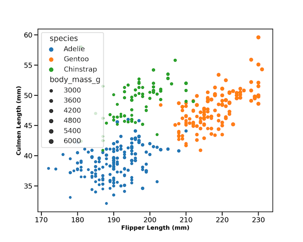
How to Remove default white edgecolor in Seaborn’s scatterplot?
We can change the default white color of edge markers or data points using argument “edgecolor”. When we specify, edgecolor=”none”, we remove edge color. Note that the value of argument is “none” not “None”.
sns.scatterplot(x="flipper_length_mm",
                y="culmen_length_mm",
                data=df,
                size="body_mass_g",
                sizes=(40,100),
                hue = 'species',
                edgecolor="none")
plt.xlabel("Flipper Length (mm)",fontweight ='bold', size=14)
plt.ylabel("Culmen Length (mm)", fontweight ='bold',size=14)
plt.savefig("Scatterplot_seaborn_no_edgecolor.png",
            format='png',dpi=150)
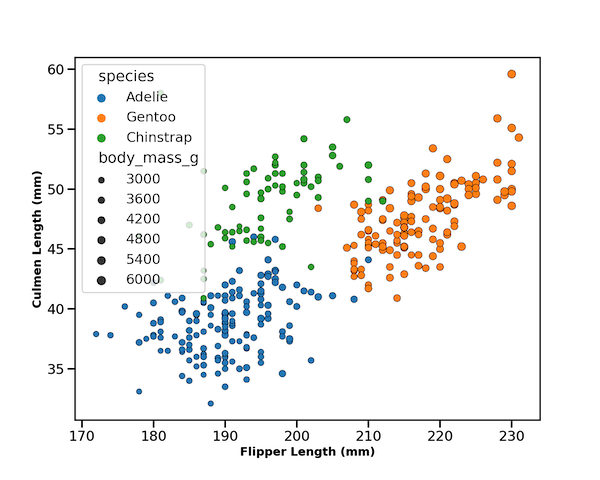
How to Change edgecolor in Seaborn’s scatterplot?
We can change the color of edge by specifying a color to “edgecolor” argument. In this example, below we set the edge color of markers or points to black with edgecolor=”black”.
plt.figure(figsize=(10,8))
sns.scatterplot(x="flipper_length_mm",
                y="culmen_length_mm",
                data=df,
                size="body_mass_g",
                sizes=(40,100),
                hue = 'species',
                edgecolor="black")
plt.xlabel("Flipper Length (mm)",fontweight ='bold', size=14)
plt.ylabel("Culmen Length (mm)", fontweight ='bold',size=14)
plt.savefig("Scatterplot_seaborn_black_edgecolor.png",
            format='png',dpi=150)
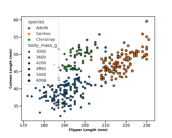
How to Change edge color and its line width in Seaborn’s scatterplot?
We can also change the thickness of edge color using linewidth argument. Here, we set the edge color to black and specify line width using linewidth argument.
plt.figure(figsize=(10,8))
sns.scatterplot(x="flipper_length_mm",
                y="culmen_length_mm",
                data=df,
                size="body_mass_g",
                sizes=(40,100),
                hue = 'species',
                edgecolor="black",
                linewidth=2)
plt.xlabel("Flipper Length (mm)",fontweight ='bold', size=14)
plt.ylabel("Culmen Length (mm)", fontweight ='bold',size=14)
plt.savefig("Scatterplot_seaborn_edgecolor_linewidth.png",
            format='png',dpi=150)
How to Change edge color and its line width in Seaborn’s scatterplot with kwargs?
Another way to customize edge color and line width using Python’s kwargs. Here we specify the edge color and linewidth as a dictionary and provide the kwargs to Seaborn’s scatterplot.
plt.figure(figsize=(10,8))
kwargs  =   {'edgecolor':"black", # for edge color
             'linewidth':1, # line width of spot
            }
sns.scatterplot(x="flipper_length_mm",
                y="culmen_length_mm",
                data=df,
                size="body_mass_g",
                sizes=(40,100),
                hue = 'species',
                **kwargs)
plt.xlabel("Flipper Length (mm)",fontweight ='bold', size=14)
plt.ylabel("Culmen Length (mm)", fontweight ='bold',size=14)
plt.savefig("Scatterplot_seaborn_edgecolor_with_kwargs.png",
            format='png',dpi=150)