Last updated on May 8, 2021
Scatterplots between two numerical variables are great to see the relationship between them. Adding colors to the data points based on the third categorical variable is often useful in understanding the relationship among the three variables.
In this post, we will learn how to color data points in a scatterplot by a third categorical variable using Matplotlib in Python.
Let us load Matplotlib’s pyplot as plt.
import matplotlib.pyplot as plt
import pandas as pd
We will use the Palmer Penguins data to color data points in a scatterplot. The Penguins data is stored in datavizpyr.com’s github page and we will load it directly.
penguins_data="https://raw.githubusercontent.com/datavizpyr/data/master/palmer_penguin_species.tsv"
# load penguns data with Pandas read_csv
df = pd.read_csv(penguins_data, sep="\t")
df.head()

	species	island	culmen_length_mm	culmen_depth_mm	flipper_length_mm	body_mass_g	sex
0	Adelie	Torgersen	39.1	18.7	181.0	3750.0	MALE
1	Adelie	Torgersen	39.5	17.4	186.0	3800.0	FEMALE
2	Adelie	Torgersen	40.3	18.0	195.0	3250.0	FEMALE
3	Adelie	Torgersen	NaN	NaN	NaN	NaN	NaN
4	Adelie	Torgersen	36.7	19.3	193.0	3450.0	FEMALE
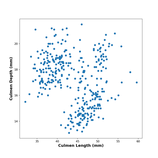
First, let us make simple scatter plot with Matpplotlib in Python. One of the ways to make a scatter plot using Matplotlib is to use scatter() function in Matplotlib.pyplot. Below, we make scatter plot by specifying x and y-axes variables from the Pandas dataframe. We also add x and y-axis labels to the scatter plot made with Matplotlib.
plt.scatter(x=df.culmen_length_mm,
            y=df.culmen_depth_mm)
plt.xlabel("Culmen Length (mm)",
            fontweight ='bold',
            size=14)
plt.ylabel("Culmen Depth (mm)",
            fontweight ='bold',
            size=14)
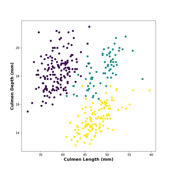
Add Colors to Scatterplot by a Variable in Matplotlib
In Matplotlib’s scatter() function, we can color the data points by a variable using “c” argument. The color argument “c” can take
- A scalar or sequence of n numbers to be mapped to colors using cmap and norm.
- A 2-D array in which the rows are RGB or RGBA.
- A sequence of colors of length n.
However, the variable we want to use to color that data points is stored as character/string variable in the dataframe. We need them as numerical numbers corresponding to each group. Therefore, we first have to convert the character variable into a categorical variable and then into numerical variable using “cat.codes” on categorical variable.
df.species.astype('category').cat.codes
We will use the converted codes to “c”‘s argument.
plt.scatter(x=df.culmen_length_mm,
            y=df.culmen_depth_mm,
            c=df.species.astype('category').cat.codes)
And we get scatterplot colored by species variable using Matplotlib.pyplot.
Here is the complete code chunk to color data points on scatterplot by a variable with x and y-ax labels and save the plot as PNG file.
plt.figure(figsize=(8,8))
plt.scatter(x=df.culmen_length_mm,
            y=df.culmen_depth_mm,
            c=df.species.astype('category').cat.codes)
plt.xlabel("Culmen Length (mm)",
            fontweight ='bold',
            size=14)
plt.ylabel("Culmen Depth (mm)",
           fontweight ='bold',
           size=14)
plt.savefig("Coloring_Scatterplot_with_Variable_matplotlib.png",
                    format='png',dpi=150)
It will be great to add legends to the scatterplot for the colors, but that is for another post.
[Update:] You may be interested in learning how to add legends to the scatterplot colored by a variable.