Last updated on October 26, 2020
Reordering bars in barplot either in ascending or descending order can help quickly see how the groups/categories vary. When you have a thrid variable, adding facet to the barplot can be very useful. In this tutorial, we will see how to reorder bars in barplot with facetting by a thrid variable using ggplot2 in R.
Let us load tidyverse and set the theme for our plots.
library(tidyverse)
theme_set(theme_bw(base_size=16))
We will use tidytuesday dataset on how US states spend on kids over time. Let us load the dataset directly from tidytuesday’s github page.
kids <- readr::read_csv('https://raw.githubusercontent.com/rfordatascience/tidytuesday/master/data/2020/2020-09-15/kids.csv')
## Parsed with column specification:
## cols(
##   state = col_character(),
##   variable = col_character(),
##   year = col_double(),
##   raw = col_double(),
##   inf_adj = col_double(),
##   inf_adj_perchild = col_double()
## )
This is how our data looks like.
kids %>% head()
## # A tibble: 6 x 6
##   state      variable  year      raw   inf_adj inf_adj_perchild
##   <chr>      <chr>    <dbl>    <dbl>     <dbl>            <dbl>
## 1 Alabama    PK12ed    1997  3271969  4665308.             3.93
## 2 Alaska     PK12ed    1997  1042311  1486170              7.55
## 3 Arizona    PK12ed    1997  3388165  4830986.             3.71
## 4 Arkansas   PK12ed    1997  1960613  2795523              3.89
## 5 California PK12ed    1997 28708364 40933568              4.28
## 6 Colorado   PK12ed    1997  3332994  4752320.             4.38
We will use inflation adjusted dollars spent per child across 50 states for years 2010 and 2015. Let us try to make barplot between state and the inflation adjusted dollars with years as facetting variable.
To reorder state by dollars per child, we use fct_reorder() function from forcats package first.
kids %>%
  drop_na()%>%
  filter(year %in% c(2010,2015))%>%
  mutate(state=fct_reorder(state,inf_adj_perchild))%>%
  ggplot(aes(y=state,
             x=inf_adj_perchild))+
  geom_col()+
  facet_wrap(~year)+
  labs(y="state")
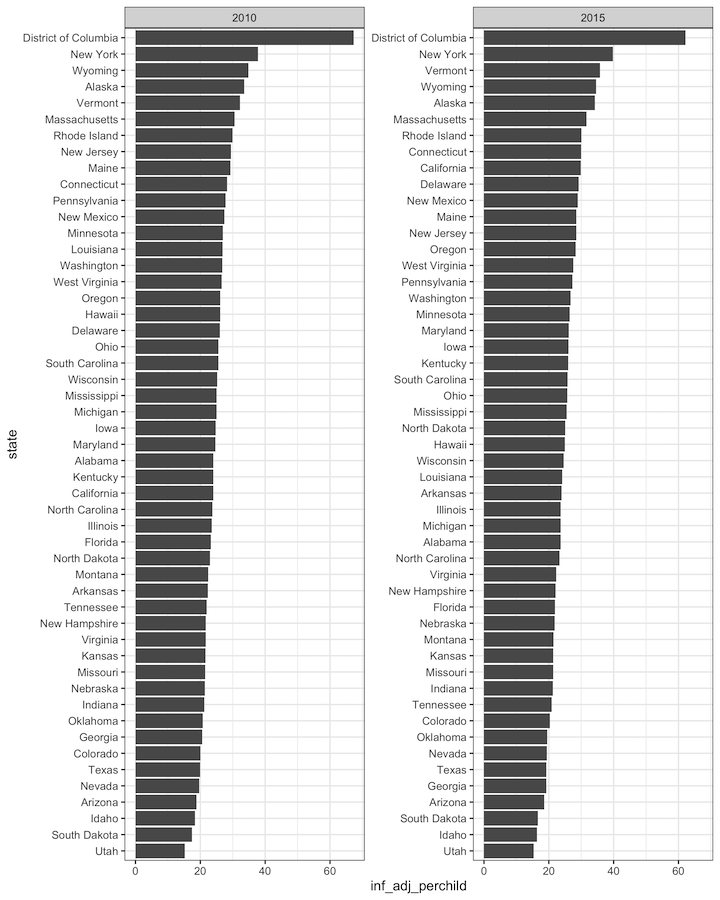
And this is how our reordered barplots with facetting looks like. Note that, we have a common y-axis. However, looking at it carefully we can see that that the states are not correctly ordered.
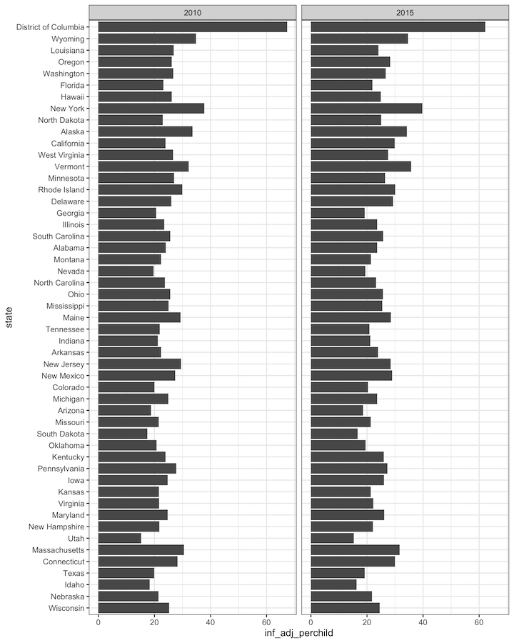
We will see similar behaviour even after changing y-axis scales with scale=’free_y’ option to facet_wrap().
tidytext, the R package made by Robinson and Silge has an easy solution to reordering with facetting. Let us load tidytext package.
library(tidytext)
Two key functions that will help with reordering and facetting are “reorder_within” and “scale_y_reordered”. At first, we use reorder_within() function as shown below to reorder bars within in each facet. And then we use scale_y_reordered() to clean up the y-axis variable names on the plot.
kids %>%
  drop_na()%>%
  filter(year %in% c(2010,2015))%>%
  mutate(state = reorder_within(state,inf_adj_perchild, year)) %>%
  ggplot(aes(y=state,
             x=inf_adj_perchild))+
  geom_col()+
  scale_y_reordered() +
  facet_wrap(~year,scales="free_y")+
  labs(y="state")
Now we have reordered barplots with the facetting variable. Notice that that the bars in each barplot is nicely ordered. Also we can see that y-axis label is different in the example.