Last updated on August 15, 2025
In this tutorial, we will learn how to make grouped violinplots with Seaborn in Python. In Seaborn, we have atleast two ways to make violinplots using Seaborn in Pyhon.
First is to use violinplot() function and make violinplot. And the second option is to use Seaborn’s catplot() function.
In this post, we will start with making a simple violinplot first and use both violinplot() function and catplot() function to learn to make grouped violinplot.
Let us load the libraries needed.
import matplotlib.pyplot as plt
import pandas as pd
import seaborn as sns
penguins_data="https://raw.githubusercontent.com/datavizpyr/data/master/palmer_penguin_species.tsv"
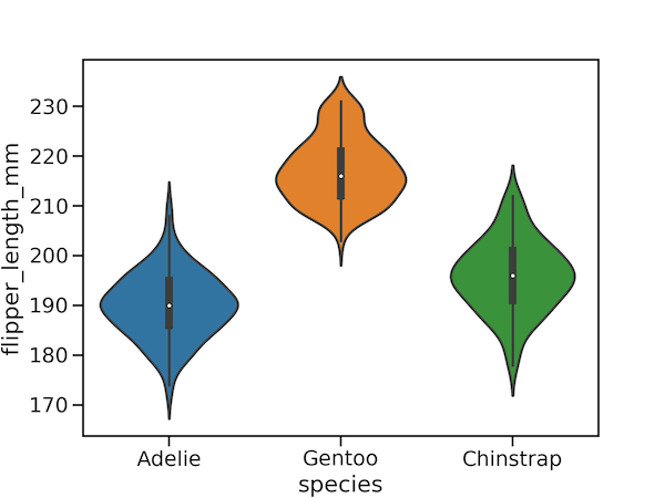
Simple Violin Plot with Seaborn
penguins_df = pd.read_csv(penguins_data, sep="\t")
penguins_df.head()
plt.figure(figsize=(8,6))
sns.violinplot(y="flipper_length_mm",
                x="species",
                data=penguins_df)
plt.savefig("violinplot_Seaborn_Python.png",
                    format='png',
                    dpi=150)
Grouped Violinplot with Seaborn violinplot()
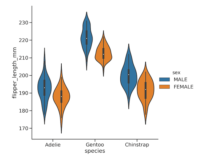
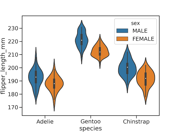
To create a grouped violin plot, we use the seaborn.violinplot() function and specify the grouping variable using the hue parameter. In the code below, we map the penguin species to the x-axis and their flipper_length_mm to the y-axis. By setting hue="sex", we instruct Seaborn to split the violins, allowing us to compare the flipper length distributions for males and females within each species side-by-side.
plt.figure(figsize=(8,6))
sns.violinplot(y="flipper_length_mm",
                x="species",
                #hue="species",
                hue="sex",
                data=penguins_df)
plt.savefig("grouped_violinplot_with_Seaborn_violinplot.png",
                    format='png',dpi=150)
Grouped Violinplot with Seaborn Catplot
An alternative and more flexible way to create a grouped violin plot is by using Seaborn’s catplot() function. This is a figure-level function that can generate many types of categorical plots. To produce a violin plot, we simply set the kind="violin" parameter. The x, y, and hue arguments work exactly as they did with violinplot(), allowing us to map our variables and create the grouping. Notice that we control the plot’s size directly with the height parameter within the function itself.
sns.catplot(y="flipper_length_mm",
                x="species",
                hue="sex",
                kind="violin",
                data=penguins_df,
                height=8)
plt.savefig("grouped_violinplot_with_Seaborn_catplot.png",
                    format='png',
                    dpi=150)