Last updated on August 24, 2025
Histograms are one of the most common ways to visualize the distribution of data.
While a single histogram shows the shape of one variable, often we want to compare two or more distributions directly.
In this post, we’ll learn how to plot multiple overlapping histograms using
Matplotlib in Python.
Setup: Import Libraries
We’ll use matplotlib.pyplot for visualization and numpy for generating some example data.
import matplotlib.pyplot as plt
import numpy as np
Simulating Example Data
To make the example reproducible, we’ll simulate two variables from Gaussian (normal) distributions using NumPy’s random.normal().
Each dataset has 5000 values but with different means.
# set seed for reproducibility
np.random.seed(42)
n = 5000

# first distribution
mean_mu1 = 60
sd_sigma1 = 15
data1 = np.random.normal(mean_mu1, sd_sigma1, n)

# second distribution
mean_mu2 = 80
sd_sigma2 = 15
data2 = np.random.normal(mean_mu2, sd_sigma2, n)
Overlapping Histograms with 2 Groups
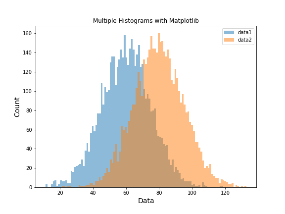
We can make histograms in Python using Matlablib’s plt.hist() function. To compare two groups, we simply call plt.hist() twice—once for each dataset.
By setting alpha, we control transparency so the histograms overlap cleanly.
Adding labels allows us to show a legend.
plt.figure(figsize=(8,6))
plt.hist(data1, bins=100, alpha=0.5, label="data1")
plt.hist(data2, bins=100, alpha=0.5, label="data2")

plt.xlabel("Data", size=14)
plt.ylabel("Count", size=14)
plt.title("Multiple Histograms with Matplotlib")
plt.legend(loc='upper right')
plt.savefig("overlapping_histograms_with_matplotlib_Python.png")
Matplotlib automatically assigns distinct colors for each dataset. The result is a clear comparison of the two distributions:
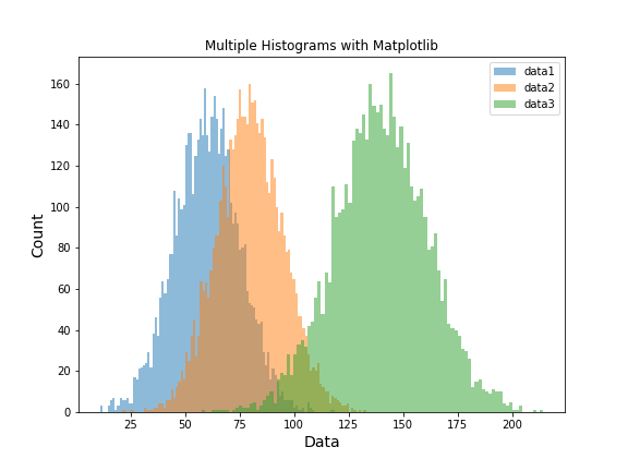
Overlapping Histograms with 3 Groups
Extending this to more distributions is straightforward—just add more calls to plt.hist().
Here, we create a third dataset by summing data1 and data2, and then plot all three together.
plt.figure(figsize=(8,6))
plt.hist(data1, bins=100, alpha=0.5, label="data1")
plt.hist(data2, bins=100, alpha=0.5, label="data2")
plt.hist(data1+data2, bins=100, alpha=0.5, label="data3")

plt.xlabel("Data", size=14)
plt.ylabel("Count", size=14)
plt.title("Multiple Histograms with Matplotlib")
plt.legend(loc='upper right')
plt.savefig("overlapping_histograms_with_matplotlib_Python_2.png")
Now we see three overlapping histograms in a single figure, making it easy to compare the different distributions.
Overlapping Histograms (Normalized to Density)
If the goal is to compare the shape of distributions rather than raw counts, normalize each histogram to a probability density. With density=True, the area under each histogram is 1. This makes comparisons meaningful even if the groups have different sample sizes.
Filled density histograms (same bins, same alpha)
Use the same bin edges for all groups so bars align perfectly.
The y-axis now shows density, not counts.
import matplotlib.pyplot as plt
import numpy as np

# Reuse data1, data2 from above (or regenerate if running standalone)
# np.random.seed(42)
# data1 = np.random.normal(60, 15, 5000)
# data2 = np.random.normal(80, 15, 5000)

# Common bin edges for perfect alignment
xmin = min(data1.min(), data2.min())
xmax = max(data1.max(), data2.max())
bins = np.linspace(xmin, xmax, 60)  # ~60 bins works well for smooth density hist

plt.figure(figsize=(8, 6))
plt.hist(data1, bins=bins, density=True, alpha=0.45, label="data1")
plt.hist(data2, bins=bins, density=True, alpha=0.45, label="data2")

plt.xlabel("Value", size=14)
plt.ylabel("Density", size=14)
plt.title("Overlapping Histograms (Normalized Density)")
plt.legend(loc="upper right")
plt.tight_layout()
plt.savefig("overlapping_histograms_density.png", dpi=300)

Publication-style outlines + optional KDE overlay
Outlines reduce visual clutter when curves overlap, and a light KDE overlay
gives a smooth shape guide (especially useful with fewer samples).
KDE is optional—comment it out if you want just histograms.
import matplotlib.pyplot as plt
import numpy as np

# Optional KDE (comment out these two lines if not desired)
from scipy.stats import gaussian_kde

xmin = min(data1.min(), data2.min())
xmax = max(data1.max(), data2.max())
bins = np.linspace(xmin, xmax, 50)
xs = np.linspace(xmin, xmax, 400)

plt.figure(figsize=(8, 6))

# Outline histograms with identical bins + density
plt.hist(
    data1, bins=bins, density=True, histtype="stepfilled",
    alpha=0.25, label="data1"
)
plt.hist(
    data2, bins=bins, density=True, histtype="stepfilled",
    alpha=0.25, label="data2"
)

# Optional KDE overlays (smoothed density curves)
kde1 = gaussian_kde(data1)
kde2 = gaussian_kde(data2)
plt.plot(xs, kde1(xs), linewidth=2, label="data1 KDE")
plt.plot(xs, kde2(xs), linewidth=2, label="data2 KDE")

plt.xlabel("Value", size=14)
plt.ylabel("Density", size=14)
plt.title("Overlapping Density Histograms (Outline) + Optional KDE")
plt.legend(loc="upper right")
plt.tight_layout()
plt.savefig("overlapping_histograms_density_outline_kde.png", dpi=300)

Tip: If groups have very different sizes and you want bars to reflect
relative frequency (i.e., percentages) rather than density, use weights:
weights=np.ones_like(data)/len(data) for each dataset. That sets the total bar height sum to 1 for each group (y-axis becomes “proportion”).
# Proportion (0–1) instead of density; bars sum to 1 per group
plt.figure(figsize=(8, 6))
plt.hist(data1, bins=bins, weights=np.ones_like(data1)/len(data1),
         alpha=0.5, label="data1")
plt.hist(data2, bins=bins, weights=np.ones_like(data2)/len(data2),
         alpha=0.5, label="data2")
plt.xlabel("Value", size=14)
plt.ylabel("Proportion", size=14)
plt.title("Overlapping Histograms (Proportion)")
plt.legend(loc="upper right")
plt.tight_layout()
plt.savefig("overlapping_histograms_proportion.png", dpi=300)

Side-by-Side Comparison: Counts vs Density vs Proportion
Building upon our previous examples with overlapping histograms, let’s now clarify the effects of different histogram normalization techniques. The subplots below offer a direct side-by-side comparison of the same two distributions, scaled by (1) raw counts, (2) density, and (3) proportions.”
All three use identical bin edges for apples-to-apples comparison. The density panel includes an optional smooth KDE overlay.
This figure places three histogram styles in one row so you can compare what changes when you switch from raw counts to density (area=1) or to proportions (bars sum to 1 per group). The bins are identical across panels to keep the comparison fair.
import numpy as np
import matplotlib.pyplot as plt
from scipy.stats import gaussian_kde

# --- Data ---
np.random.seed(42)
n = 5000
data1 = np.random.normal(60, 15, n)
data2 = np.random.normal(80, 15, n)

# --- Common bins ---
xmin = min(data1.min(), data2.min())
xmax = max(data1.max(), data2.max())
bins = np.linspace(xmin, xmax, 60)

# KDEs
xs = np.linspace(xmin, xmax, 400)
kde1 = gaussian_kde(data1)
kde2 = gaussian_kde(data2)

# --- Figure ---
fig, axes = plt.subplots(1, 3, figsize=(15, 4.5), sharex=True)

# Counts
axes[0].hist(data1, bins=bins, alpha=0.5, label="data1")
axes[0].hist(data2, bins=bins, alpha=0.5, label="data2")
axes[0].set_title("Counts")
axes[0].set_ylabel("Count")
axes[0].legend(loc="upper right")

# Density
axes[1].hist(data1, bins=bins, density=True, alpha=0.45, label="data1")
axes[1].hist(data2, bins=bins, density=True, alpha=0.45, label="data2")
axes[1].plot(xs, kde1(xs), linewidth=2, label="data1 KDE")
axes[1].plot(xs, kde2(xs), linewidth=2, label="data2 KDE")
axes[1].set_title("Density (area = 1)")
axes[1].set_ylabel("Density")

# Proportion
w1 = np.ones_like(data1) / len(data1)
w2 = np.ones_like(data2) / len(data2)
axes[2].hist(data1, bins=bins, weights=w1, alpha=0.5, label="data1")
axes[2].hist(data2, bins=bins, weights=w2, alpha=0.5, label="data2")
axes[2].set_title("Proportion (sum = 1)")
axes[2].set_ylabel("Proportion")

for ax in axes:
    ax.set_xlabel("Value")

# ✅ Put suptitle first
fig.suptitle("Overlapping Histograms: Counts vs Density vs Proportion", fontsize=14)

# ✅ Then run tight_layout, telling it to leave room (top=0.9 leaves 10% for title)
fig.tight_layout(rect=[0, 0, 1, 0.9])

plt.savefig("histograms_counts_density_proportion.png", dpi=300)
plt.show()

When to use which?
- Counts: good when sample sizes are equal and you care about absolute frequency.
- Density: best for comparing shape (area=1), especially when sample sizes differ.
- Proportion: intuitive when you want “share of observations” in each bin (bars sum to 1).
Overlapping Histograms in Matplotlib — FAQ
-
How do I control the number of bins in Matplotlib histograms?
Use thebinsparameter inplt.hist(). An integer sets equal-width bins, or pass an array of edges for custom widths. -
What’s the difference between
density=Trueand using weights for normalization?
density=Truescales area to 1 (compare shapes). Weights (e.g.,weights=np.ones_like(data)/len(data)) make bars sum to 1 (compare proportions). -
How do I avoid histograms overlapping too much and becoming unreadable?
Increase transparency (alpha), use outlines (histtype="step"), or plot side-by-side. For many groups, use density curves instead. -
How can I make overlapping histograms comparable when sample sizes differ?
Scale withdensity=Trueor weights so group sizes don’t distort the comparison. -
Can I plot overlapping histograms with Seaborn or Plotly instead of Matplotlib?
Yes. Seaborn:sns.histplot(..., hue="group"). Plotly:px.histogram(..., barmode="overlay"). -
How do I add a smooth curve (KDE) on top of my histogram?
Use SciPy’sgaussian_kdeor Seaborn’ssns.kdeplot(). -
How do I compare histograms when the groups have very different ranges?
Use the same bin edges for alignment, or rescale data. Otherwise, switch to boxplots or violin plots for clarity.
See also: Matplotlib hist() documentation.